Chapter 11 Interpreting Machine Learning Results
This is an Open Access web version of the book Practical Machine Learning with R published by Chapman and Hall/CRC. The content from this website or any part of it may not be copied or reproduced. All copyrights are reserved.
If you find an error, have an idea for improvement, or have a question, please visit the forum for the book. You find additional resources for the book on its companion website, and you can ask the experimental AI assistant about topics covered in the book.
If you enjoy reading the online version of Practical Machine Learning with R, please consider ordering a paper, PDF, or Kindle version to support the development of the book and help me maintain this free online version.
In the previous chapters, you learned about different machine learning algorithms and applied machine learning models to predict continuous and categorical outcomes based on a set of predictor variables. We have also touched upon how to analyze the prediction errors to evaluate the performance of a machine learning model.
This chapter examines how a model’s predictor variables impact the predictions of an outcome. In other words, what factors are most important for the model’s outcome prediction, and how much do they contribute.
Being able to interpret machine learning results is crucial for many applications. For example, mortgage lenders can use machine learning models to estimate default risk scores for loan applications.
If a loan applicant is not approved, the bank must be able to explain the factors influencing the model’s prediction to ensure that the decision is fair and unbiased.
Not that long ago, many machine learning models, especially Deep Learning models, would be considered black box models, meaning that although they generate excellent prediction results, they fail to provide insights on how the predictions are derived, which variables are the most important ones, and how much each variable contributed to the predicted outcome. The black box problem turned some analysts to linear OLS models because their results are much more interpretable.100 However, this caused a dilemma. Although the prediction results from linear OLS models are more interpretable, they often do not produce a predictive quality comparable to non-linear machine learning models such as Random Forest or Neural Network.
The good news is that researchers made significant progress in recent years in machine learning interpretability. There are so many techniques to interpret machine learning models that we can only cover a few selected algorithms in this book.101
In this chapter, we will introduce interpretation techniques to answer the following three questions for specific machine learning models, such as tree-based models, but also for machine learning models in general:
Impacts of Predictor Variable Change
Question 1: If the value of a predictor variable changes, how will this impact the predicted outcome?
In Section 11.5, we analyze how the prediction for a specific observation would change if one of the values for one of the predictor variables changes. We will visualize the result with a so-called Ceteris Paribus Plot.
As an example, think about the loan applicant case. How would the predicted risk score change if the applicant’s yearly salary were higher or lower?
We also use Partial Dependence Plots in Section 11.5 to quantify and visualize the impact on model predictions overall when the value for a predictor variable changes. Partial Dependence Plots are a summary of Ceteris Paribus Plots for all observations and thus explain the overall impact of a predictor variable’s change.
Predictor Variable Importance
Question 2: Which variables are more or less important for the prediction, and which variables can potentially be dropped?
Section 11.6 focuses on tree-based models, and we quantify how important each predictor variable is for the model’s outcome prediction. We will visualize the results in a Variable Importance Plot (VIP) that shows a list of all predictor variables and their importance for the model prediction.
We quantify Variable importance in two ways:
In Section 11.6.1, we use an impurity reduction measure to analyze how much each predictor variable reduces impurity when splitting the observations in the Decision Trees from parent nodes to the related two child nodes.
In Section 11.6.2, we estimate Variable Importance by the damage to the model’s predictive quality (the increase of \(MSE\)) when the influence of a specific predictor variable is removed. The greater the damage, the higher the importance of that particular variable.
Predictor Variable Contribution
Question 3: What is a predictor variable’s contribution to the predicted outcome of an observation?
We will introduce two techniques quantifying the contribution of predictor variables to a specific prediction: SHAP (SHapley Additive exPlanations) values and the LIME (Local Interpretable Model-agnostic Explanations) approach.
Section 11.7 introduces SHAP values. SHAP values measure how much each predictor variable contributes to the prediction result for an observation.
Section 11.8 introduces LIME. In contrast to SHAP values, LIME does not interpret machine learning models directly. Instead, LIME approximates a machine learning model with a simpler interpretable model (e.g., a linear OLS) in the neighborhood of an observation. The simpler model is then used for interpretation.
In the case of our example with the loan applicant, SHAP values and LIME values could provide the following kind of information: Because of the applicant’s young age, the risk score is higher by 17 units, because of the applicant’s low income, the risk score is higher by 5 units, and because the applicant never defaulted on a loan their, risk score is lower by 12 units.
11.1 Learning Outcomes
This section outlines what you can expect to learn in this chapter. In addition, the corresponding section number is included for each learning outcome to help you to navigate the content, especially when you return to the chapter for review.
In this chapter, you will learn:
How machine learning interpretation methodologies can be categorized into model-agnostic and model-specific methods (see Section 11.3).
How machine learning interpretation methodologies can be categorized into local methods (i.e., related to a specific observation) and global methods (i.e., related to the complete model; see Section 11.3).
How you can generate and interpret Ceteris Paribus Plots to analyze the impact of changing predictor variables related to a specific observation (see Section 11.5.1).
How you can generate and interpret Partial Dependence Plots to analyze the impact of changing predictor variables for a machine learning model (see Section 11.5.2).
How you can use Variable Importance Plots (VIP) to identify predictor variables that are more or less important for the prediction. The less important variables are potential candidates to be dropped from the analysis (see Section 11.6).
How you can use SHAP values to quantify the contribution of each predictor variable to the prediction of a specific observation of interest (see Section 11.7).
How you can use the Local Interpretable Model-agnostic Explanations (LIME) methodology to approximate a non-linear machine learning model with a linear OLS model. The latter can then be used to interpret the related impacts of the predictor variables (see Section 11.8).
11.2 R Packages Required for the Chapter
This section lists the R packages that you need when you load and execute code in the interactive sections in RStudio. Please install the following packages using Tools -> Install Packages \(\dots\) from the RStudio menu bar (you can find more information about installing and loading packages in Section 3.4):
The
riopackage (Chan et al. (2021)) to enable the loading of various data formats with oneimport()command. Files can be loaded from the user’s hard drive or the Internet.The
janitorpackage (Firke (2023)) to rename variable names to UpperCamel and to substitute spaces and special characters in variable names.The
tidymodelspackage (Kuhn and Wickham (2020)) to streamline data engineering and machine learning tasks.The
kableExtra(Zhu (2021)) package to support the rendering of tables.The
learnrpackage (Aden-Buie, Schloerke, and Allaire (2022)), which is needed together with theshinypackage (Chang et al. (2022)) for the interactive exercises in this book.The
shinypackage (Chang et al. (2022)), which is needed together with thelearnrpackage (Aden-Buie, Schloerke, and Allaire (2022)) for the interactive exercises in this book.The
wooldridgepackage (Shea (2023)) to provide the wage data that will be used throughout this chapter.The
rangerpackage (Wright and Ziegler (2017)) to create a Random Forest.The
parallelpackage (R Core Team (2022)) to perform parallel processing.The
DALEXpackage (Biecek (2018)) to use various techniques, including SHAP values, to interpret machine learning results.The
DALEXtrapackage (Maksymiuk, Gosiewska, and Biecek (2020)) extends theDALEXpackage. Extra functionality provided byDALEXtraincludes working directly withtidymodelstrained workflows.The
vippackage (Greenwell and Boehmke (2020)) to generate Variable Importance Plots.The
limepackage (Hvitfeldt, Pedersen, and Benesty (2022)) to use the LIME approach to interpret machine learning models.
11.3 Categorizing Interpretation Methods
In what follows, we will introduce several interpretation methodologies. Not every methodology can be applied to all models. To help you decide which methodology to use for which interpretation task, we categorize them by tasks in this section.
For example, some methods are only appropriate for explaining a prediction result for a specific observation (local interpretation methods). In contrast, others are only appropriate to help us understand a model in general and how it makes predictions overall (global interpretation methods).
Going back to the previous example of lenders making a loan decision, you have to decide if you want to analyze why a specific applicant (observation) is not approved for a loan (local interpretation methods) or how, in general, the model predicts loan risk related to one particular predictor variable (global interpretation methods).
Local vs. Global Interpretation
- Local Interpretation:
-
To analyze the prediction of a specific observation and to interpret the impact of predictor variables on that specific observation, we use local interpretation methodologies.
- Global Interpretation:
-
To analyze the predictions of a machine learning model in general and to interpret the impact of predictor variables regardless of specific observations, we use global interpretation methodologies.
Another property of interpretation methodologies you need to consider is whether the interpretation methodology is model-specific or model-agnostic. Some methodologies are developed for specific machine learning models (model-specific), and while others can be applied to interpret almost every machine learning model (model-agnostic). For example, an impurity-based Variable Importance Plot (see Section 11.6.1), which is related to decision rules in a Decision Tree, can be applied to tree-based models like Random Forest but cannot be applied to Neural Networks.
In contrast, a Ceteris Paribus Plot or a Partial Dependence Plot can be applied to any machine learning model as long as it generates predictions (model-agnostic).
Model-Specific vs. Model-Agnostic Interpretation
- Model-Specific:
-
Interpretation methodologies that can only be applied to a specific model type are called model-specific.
- Model-Agnostic:
-
Interpretation methodologies that can be applied regardless of which model was used to generate the predictions are called model-agnostic.
11.4 Data, Model Design, and Workflow-Model
For all interpretation methodologies that we introduce in the following sections, except for the interactive Section 11.7.3,102 we use the same dataset and the same workflow model. The objective is to predict hourly wages based on several predictor variables such as education, tenure, and sex.
In this section, we will briefly introduce the data and the workflow for the wage predicting example.
For the data, we use the wage1 dataset from the wooldridge package.103 The wage1 dataset contains hourly wage data for \(526\) observations together with several predictor variables. To keep it simple, we use only the predictor variables for a person’s years of education \((Educ)\), their tenure at their current job \((Tenure)\), and a dummy variable, \(Female\) (with \(1\) for female) that indicates if the person is female or not:
library(rio)
library(janitor)
library(tidymodels)
library(wooldridge)
DataWage=wage1 |>
         clean_names("upper_camel") |>
         select(Wage, Educ, Tenure, Female) |>
         mutate(Female=as.factor(Female))
Adding more predictor variables would likely improve the predictive quality, but again, we try to keep things simple for this example.
As usual, we divide the data into training (DataTrain) and testing (DataTest) data:
set.seed(777)
Split7525=initial_split(DataWage, prop=0.75, strata=Wage)
DataTrain=training(Split7525)
DataTest=testing(Split7525)
We will use a Random Forest model to predict the wage, and as before, for better performance, we set the number of threads to run parallel to num.threads=detectCores(). This determines that we run as many threads in parallel as the computer has processing cores:
library(parallel)
ModelDesignRF=rand_forest() |>
              set_engine("ranger", num.threads=detectCores(),
                         importance="impurity") |>
              set_mode("regression")

RecipeWage=recipe(Wage~., data=DataTrain)

set.seed(777)
WfModelWageRF=workflow() |>
              add_model(ModelDesignRF)|>
              add_recipe(RecipeWage) |>
              fit(DataTrain)
In the code block above, the model design and the recipe are defined, and both are added to the workflow WfModelWageRF, which is then fitted to the training data. Later in Section 11.6.1, we will create an impurity-based Variable Importance Plot, which requires us to generate the underlying data during the workflow’s fitting stage. Therefore, we set importance="impurity" in the model design.
In the following sections, we will interpret the workflow model WfModelWageRF as a whole (global interpretation), and we will interpret a specific observation of interest (local interpretation). The observation of interest is the observation of a woman (\(Female=1\)) with 17 years of education (\(Educ=17\)) and 18 years of tenure in her current job (\(Tenure=18\)). She has an hourly wage of $8.90:104
## # A tibble: 1 × 4
##    Wage  Educ Tenure Female
##   <dbl> <dbl>  <dbl> <fct>
## 1   8.9    17     18 1
To make it easier to address this observation of interest later on, we call the women Helga and the related observation ObsHelga.
It is essential to distinguish between Helga’s actual hourly wage ($8.90) and her predicted hourly wage — the wage predicted by the Random Forest model. In the following sections, we can only explain Helga’s predicted hourly wage \((.pred)\) but not her true wage. Consequently, we have to use the data frame with Helga’s predictor variable values (ObsHelga) and augment it with the predicted wage:
## # A tibble: 1 × 5
##   .pred  Wage  Educ Tenure Female
##   <dbl> <dbl> <dbl>  <dbl> <fct>
## 1  9.24   8.9    17     18 1
You can see see that Helga’s true hourly wage is $8.90, while the Random Forest model predicted a wage of $9.24 \((.pred=9.24)\).
11.5 Visualizing the Impact of Changing Predictor Variables
In this section, we will use Ceteris Paribus Plots and Partial Dependence Plots to visualize how a change in a single predictor variable impacts the predictions for the outcome variable.
We will analyze changes of the variable \(Tenure\), but the methodology is also valid for changes of other predictor variables.
11.5.1 Ceteris Paribus Plots
A Ceteris Paribus Plot visualizes how changing the values for a predictor variable impacts the prediction for a single observation of interest (local interpretation). The observation of interest here is the observation for Helga:
## # A tibble: 1 × 5
##   .pred  Wage  Educ Tenure Female
##   <dbl> <dbl> <dbl>  <dbl> <fct>
## 1  9.24   8.9    17     18 1
In the previous section, we predicted a wage of $9.24 for Helga. But how would Helga’s predicted wage change if her \(Tenure\) was greater or smaller and all other predictor variable values would remain the same?
To find the answer, we need to leave \(Educ=17\) and \(Female=1\) as they are. Then, we use the Random Forest workflow WfModelWageRF to generate wage predictions for various values of \(Tenure\).105 The graphical representation of the result leads to the Ceteris Paribus Plot in Figure 11.1.
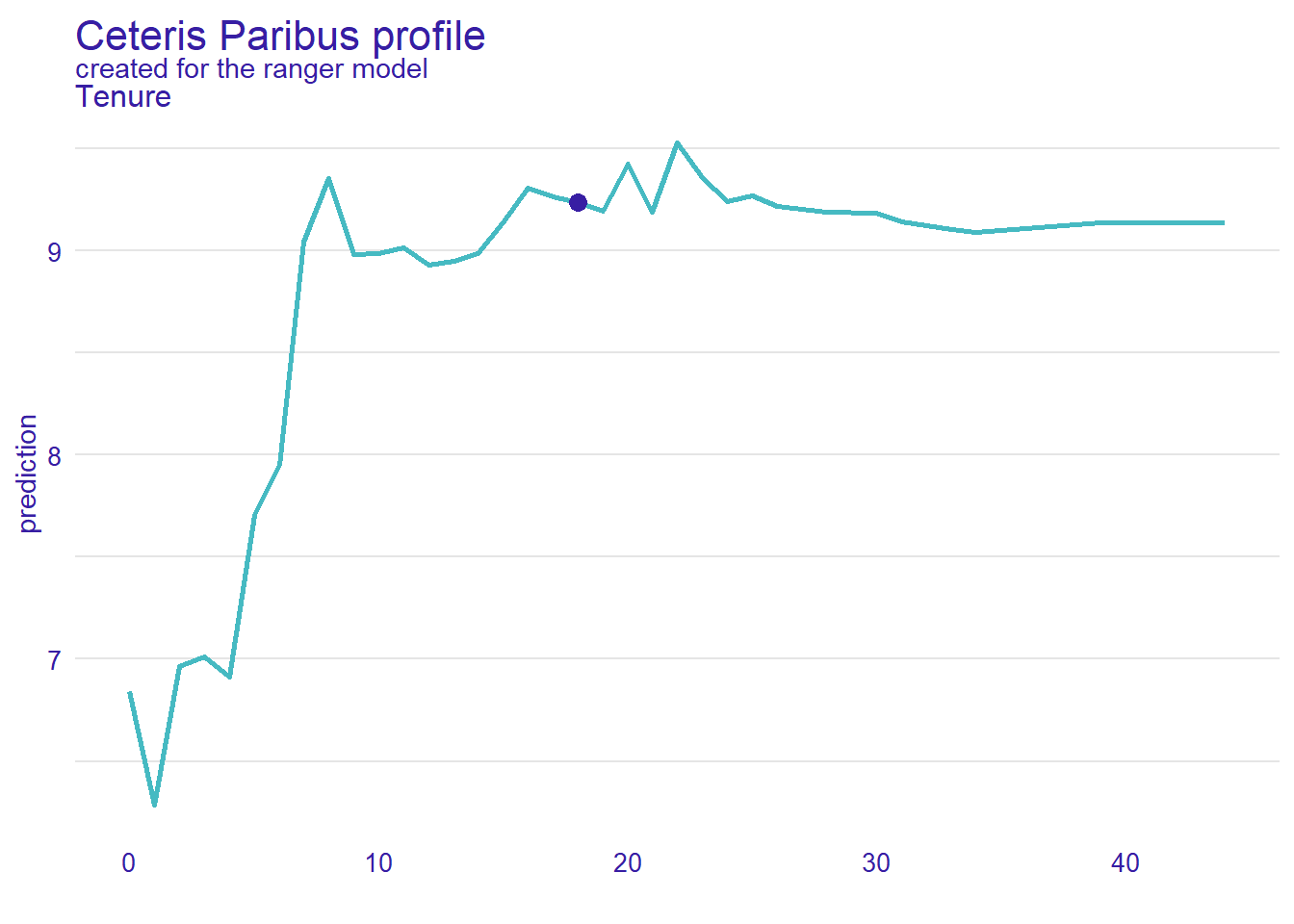
FIGURE 11.1: Ceteris Paribus Plot for the Variable Tenure
In the Ceteris Paribus Plot, the \(Tenure\) values are plotted against the related wage predictions from the Random Forest model. The plot in Figure 11.1 was generated with the following R code:
library(DALEX)
ExplainerRF=DALEX::explain(extract_fit_engine(WfModelWageRF),
                           data=DataTrain, y=DataTrain$Wage)

CPPlot=predict_profile(explainer=ExplainerRF,
                       new_observation=ObsHelga,
                       variables="Tenure")
plot(CPPlot, variables="Tenure")
Most interpretation algorithms work in two steps. First, an explainer object (here \(ExplainerRF\)) is created, which is a container that stores the training data, the model design, and some other information but does not perform any interpretation tasks. In the second step, the interpretation is performed with another command based on the information from the explainer object.
Note, when we create the explainer object with the command explain(), the command is prefixed with DALEX::. This ensures that the explain() command from the DALEX package is used. It is necessary because both the tidyverse package and the lime package that we use later in Section 11.8 contain a command explain().
The Ceteris Paribus plot is created with the command predict_profile(). Arguments are the explainer (explainer=ExplainerRF), the observation used for the plot (new_observation=ObsHelga), and the variable that is analyzed (variables="Tenure").
In the Ceteris Paribus plot in Figure 11.1, Helga’s \(Tenure/\widehat{Wage}\) combination is marked with a blue dot. You can see that Helga’s predicted wage would mostly stay the same if she had some more or less tenure. However, if Helga had much less tenure \((Tenure<8)\), her predicted wage would be much smaller. All this makes perfect sense for somebody with a high tenure and education.
A Ceteris Paribus plot interprets only the prediction for a specific observation (local interpretation). What if we want to get a global interpretation of the whole prediction model? The following section provides a tool for this purpose.
11.5.2 Partial Dependence Plot
The idea behind Partial Dependence Plots is first to create a Ceteris Paribus plot for every or at least many observations from the training dataset and then create an average of these individual plots.
You can see the individual Ceteris Paribus plots in Figure 11.2 as the light grey lines. Each line represents a Ceteris Paribus plot for one of the training observations. The ensemble of grey lines in Figure 11.2 is called an Individual Conditional Expectation (ICE) plot.

FIGURE 11.2: ICE Plot Combined with a Partial Dependence Plot
If we calculate for each \(Tenure\) value the average from the related values of the light grey lines (the Ceteris Paribus plots), we get the bold blue line, which is called a Partial Dependence Plot (PDP).
The code to generate the ICE plot and the PDP plot is shown below:
library(DALEX)
ICEPDPPlot=model_profile(explainer=ExplainerRF, variables="Tenure",
                         N=NULL)
plot(ICEPDPPlot,geom="profiles")+ggtitle("ICE & PDP for Tenure")
The model_profile() command generates the plot based on the explainer object defined above (explainer=ExplainerRF), and selects the predictor variable to be analyzed (variables="Tenure"). The argument N=NULL determines that all training observations are used for the ICE plot. Alternatively, N random observations from the training dataset can be used.
The PDP plot (bold blue line) in Figure 11.2 shows how \(Tenure\) determines the predicted wage for the Random Forest model.
In the first 17 years, higher \(Tenure\) values increase the predicted wage with a sharp increase in years 16 and 17. Afterward, a longer tenure does not lead to a significant increase in predicted wage. This result is what one would expect. Companies value tenure up to a certain degree. Afterward, an increasing tenure neither helps nor hurts.
11.6 Variable Importance for Tree-Based Models
In the previous section, we used Ceteris Paribus plots and Partial Dependence Plots to analyze the quantitative impact of predictor variable changes. In contrast, Variable Importance Plots (VIP) focus on the relevance of a predictor variable for a model rather than its quantitative impact on the outcome. As the name suggests, VIPs focus on predictor variable importance.
VIPs can help you decide if a specific predictor variable is important enough to be kept in a model or if it should be dropped.
11.6.1 Impurity-Based Variable Importance Plot
When we covered Decision Trees in Section 10.3, the task was to predict survival on the Titanic — a classification task. For a classification task, every split that is used in a tree reduces the impurity from the parent node (before the split) to the two resulting child nodes (after the split). In Section 10.3, we used the Gini coefficient to measure impurity reduction.
When using a Decision Tree to predict a continuous outcome, every split also reduces the impurity from the parent node (before the split) to the two resulting child nodes (after the split). However, we can no longer use the Gini coefficient to measure impurity reduction because the Gini coefficient is a specific measure for classification only. An alternative for a continuous outcome variable to measure impurity reduction is to use the variance of the outcome variable before and after the split.
Let us use the wage prediction example to show how this works. Assume in a Decision Tree, we have already corrected for tenure and education at a higher level of the tree. Now we reach a decision rule that splits for Sex=male. Assuming sex discrimination is present, this parent node would contain men with high salaries (positive deviation from the mean) and women with low salaries (negative deviation from the mean), leading to a high variance. Now, if we split by Sex=male, the left child node would only contain men. Since the new mean for this child node would be higher, the deviation of the higher-paid male observations from the new mean would be relatively low. The same is true in a mirrored way for the female node. The new mean in this node would be lower; thus, the deviation from this mean for the lower-paid female workers would also be relatively low. The decision rule Sex=male reduced the variance and thus the impurity in the two child nodes compared to the parent node.
Regardless, if we measure impurity with the Gini coefficient or through variance, in both cases, the more a splitting rule can reduce the impurity from the parent node to the two child nodes, the more effective the related predictor variable.
The importance of a variable in an impurity-based Variable Importance Plot is measured as the average impurity reduction for all splits, where the variable was the splitting variable.106
Since all tree-based models consist of one or more Decision Trees and each Decision Tree consists of several splits, impurity-based Variable Importance can be measured for all tree-based models. However, since it cannot be used for models that are not tree-based, it is a model-specific interpretation method.
Since impurity-based Variable Importance is calculated for a whole model and not for a specific observation, it is a global interpretation method.
Instead of using the training data to calculate the reduction of impurity for the predictor variables, the VIP package uses the Out-of-Bag data (see Section 10.4.1) to calculate the Variable Importance. Using Out-of-Bag data rather than training data improves the generality of Variable Importance plots.
The impurity reduction is calculated at the time when the Decision Trees are created. Therefore, to trigger the calculation of impurity reduction for every split, the argument importance="impurity" is required in the workflow command.107 If we want to use a different importance measure like importance="permutation" in the following section, we have to set the argument importance= differently before the workflow is fit to the training data, or we have to repeat the fitting.

FIGURE 11.3: Impurity-Based Variable Importance Plot for Wage Model
The R code to generate the impurity-based Variable Importance plot is shown below:
After loading the library vip, the vip() command creates the Variable Importance plot. The command’s major argument is the fitted prediction model. It is extracted from the workflow WfModelWageRF with the extract_fit_engine() command.
The bar plot in Figure 11.3 suggests that education \((Educ)\) carries the greatest importance for the model, followed by the \(Tenure\), and then the variable \(Female\). The variable \(Female\) has a lower importance than the other two variables, but it is still important.
11.6.2 Permutation-Based Variable Importance Plot
An alternative to using impurity reduction as a criteria for Variable Importance is permutation-based Variable Importance.108
The basic idea is to switch off a specific predictor variable and see how much damage this creates in terms of an increased error. Afterward, the procedure is repeated for all other predictor variables. The greater the damage caused by switching off a specific predictor variable, the greater the importance of this predictor variable.
This raises the question, how can we switch off a predictor variable? Setting all values to zero is not an option because it would introduce bias. Setting the values to the mean or median of the predictor variable’s values would be an option, but it would wipe out information about the variable’s distribution.
The way permutation-based Variable Importance methodology approaches the problem is to scramble the values for the switched-off variable over all observations, thus maintaining mean, median, and the distribution of the switched-off variable. Afterward, the scrambled (switched-off) predictor variable and the other predictor variables are used to predict the outcome. The difference between the now bigger prediction error and the original prediction error measures the damage done by scrambling and thus measures the Variable Importance.
The procedure is repeated for all other predictor variables, and the damage, i.e., the Variable Importance, is compared in the Variable Importance plot.
Since permutation-based Variable Importance is calculated overall for a model, regardless of a specific observation, it is a global interpretation method.
Permutation-based Variable Importance uses the Out-of-Bag data from each Decision Tree rather than the training data. This improves the generality of the methodology but also ties it to tree-based models. Therefore, it is a model-specific interpretation method. However, model-agnostic approaches for permutation also exist. They usually use a validation dataset instead of the Out-of-Bag dataset.
Since the Out-of-Bag data for each Decision Tree are used to calculate permutation-based Variable Importance, the required data are calculated when the Decision Trees are developed — when the Random Forest workflow model is fitted to the data. To trigger this calculation the argument importance="permutation" has to be set during model design.
Remember, we set importance="impurity" in Section 11.4, when we created the workflow. Therefore, we have to create the workflow again with the changed argument and again fit it to the training data:
ModelDesignRF=rand_forest() |>
  set_engine("ranger", num.threads=detectCores(),
  importance="permutation") |>
  set_mode("regression")

set.seed(777)
WfModelWageRF=workflow() |>
          add_model(ModelDesignRF)|>
          add_recipe(RecipeWage) |>
          fit(DataTrain)
The command to create permutation-based Variable Importance is the same as the one for impurity-based Variable Importance (see Section 11.6.1), except it requires us to set the metric for the error via the metric= argument:
Options for the error metric include metric="rmse" (root mean squared error), metric="mae" (mean absolute error), and metric="rsq" (\(r^2\)). It is recommended to use the metric that was used for the underlying machine learning model.

FIGURE 11.4: Permutation-Based Variable Importance Plot for Wage Model
The permutation-based Variable Importance Plot in Figure 11.4 is similar to the impurity-based Variable Importance Plot in Figure 11.3, except that the variable \(Female\) now shows a greater importance.
This reminds us to be careful when working with interpretation algorithms and look at the bigger picture and not so much at the details when interpreting the results.
11.7 SHAP Contribution of Predictor Variables
An interpretation methodology that can quantify the contributions of each predictor variable’s value to the outcome prediction of a specific observation is the SHAP values methodology.
The SHAP values methodology is a recent approach to interpreting machine learning predictions (see S. Lundberg and Lee (2017)). However, the basic idea for the SHAP values methodology is based on a game theory approach called SHAPLEY values after its original author Shapley (1953).
In this section, we first introduce SHAPLEY values in Section 11.7.1. Then, in Section 11.7.2, we transfer the concept of SHAPLEY values to the concept of SHAP values.
11.7.1 SHAPLEY Values
SHAPLEY values were developed by Shapley (1953). It is a game theory approach to divide a gain from a project among the individuals who contributed to the project. The idea is to use the marginal contribution to distribute the gain. The marginal contribution of an individual can be calculated when comparing the gain with and without the contribution of that individual. The challenge is that marginal contributions for the same individual can differ depending on which level of a project an individual starts contributing, but this can be better explained with an example.
Suppose, as an example, a business hires three economists: The three economists, Angela, Bruce, and Carsten, contribute to the company with their economic advice. Before any of the three economists were hired, the business made a profit of $7 million (measured in thousands of dollars and displayed as 7,000 at the top of the flow chart in Figure 11.5).
We call a group of contributors to a project a coalition, and because none of the economists contributed in the scenario at the beginning of the flow chart in Figure 11.5, this scenario is labeled as Coalition: none.
In contrast, the scenario at the bottom of the flow chart in Figure 11.5 Coalition: ABC indicates that all three economists contribute, which leads to a profit of \(7{,}107\). Comparing the profit from Coalition: none to Coalition: ABC shows that all economists’ contribution is \(107\).
Given that the three economists have slightly different talents (Angela specializes in financial economics, Bruce specializes in health economics, and Carsten specializes in machine learning), we cannot equally divide the profit of \(107\) among the three economists. We have to find out the individual marginal contribution of each economist. The marginal contribution is calculated as the difference between a coalition where an individual contributed and a coalition where the same individual did not contribute. There is a problem: The contribution varies for each individual economist depending on which stage they joined the project.
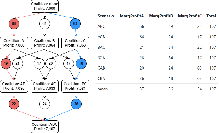
FIGURE 11.5: The Shapley Graph
For example, when we follow the red path in the flow chart in Figure 11.5, we can see that Angela joins first, then Bruce, and lastly, Carsten. When Angela joins, the profit increases from Coalition: none by \(66\) to Coalition A, where Angela is the only contributor (from \(7{,}000\) to \(7{,}066\)). When Bruce joins, the profit increases by \(19\), and finally, when Carsten joins, the profit increases by \(22\). Therefore, Angela’s marginal contribution is \(66\), Bruce’s is \(19\), and Carsten’s is \(22\). Should Angela get \(66\) of the total contribution of \(107\)? This is more than half and does not sound reasonable.
Why this is not reasonable becomes more clear when we look at the blue path in the flow chart in Figure 11.5. Following that path, we see that Angela joins last and contributes only \(26\).
The different results make sense: In the initial coalition, the company did not have an economist, so when Angela joins, she contributes all of the economics expertise. However, following the blue path, Angela joins last. Before she joined, the company had already hired two economists, contributing their economics knowledge and their specialties. When Angela joins, the profit still goes up because she adds financial economics expertise, but economics, in general, was already well covered by Bruce and Carsten.
The order in which coalition members join should not influence their estimated overall contribution. Therefore, we could look at every possible scenario where Angela can join, calculate her marginal contribution for each scenario, and then calculate the average as an estimate of Angela’s overall contribution.
This is exactly the idea behind SHAPLEY values, and you can see how it works in the table displayed in Figure 11.5. Since we have three economists, there are precisely six \((3!=1\cdot 2\cdot3)\) different scenarios for the order in which they can join the project, and these six scenarios are displayed in the rows of the table. When Angela joins first (Scenarios ABC and ACB), her contribution is \(66\). When she joins second (Scenarios BAC and CAB), her contribution is \(21\) and \(20\), receptively. When she joins last (Scenarios BCA and CBA) her contribution is \(26\). The average for all six scenarios is \(37\), which is Angela’s estimated overall contribution — her SHAPLEY value.
We can follow a similar procedure for Bruce and Carsten, and we get SHAPLEY values of \(36\) and \(34\), respectively. They are displayed in the last row of the table in Figure 11.5 and add up to the overall contribution of the three economists of \(107\).
SHAPLEY values always ensure that their sum adds up to the total contribution (\(107\) in our case).
11.7.2 From SHAPLEY to SHAP Values
Now that you understand how SHAPLEY values are calculated, it is a small step to understand SHAP values.
The underlying idea of the SHAP values approach is to apply the SHAPLEY logic to the SHAP approach.109 This is reflected in the definition of SHAP values:
SHAP values quantify the contributions of all predictor variables’ values to the prediction for a specific observation.
Since the SHAP values approach is based on an individual observation, the SHAP algorithm is considered local.
Since SHAP can be applied to any machine learning model that can generate predictions, the algorithm is considered model-agnostic.
To explain the transition from the SHAPLEY to the SHAP approach, let us work with the same wage prediction example as in the previous sections. Again, our goal is to explain the wage prediction of the Random Forest model from Section 11.4. In detail, we want to estimate the contributions of the predictor variable values \(Educ=17\), \(Tenure=18\), and \(Female=1\) to the predicted wage \((.pred)\) for the observation Helga:
## # A tibble: 1 × 5
##   .pred  Wage  Educ Tenure Female
##   <dbl> <dbl> <dbl>  <dbl> <fct>
## 1  9.24   8.9    17     18 1
When we discussed SHAPLEY values in Section 11.7.1, we considered six scenarios where three economists joined a project in a different order. Similarly here, the values for the predictor variables (\(E:=Educ=17\), \(T:=Tenure=18\), and \(F:=Female=1\)) are added step-wise, in different order to predict Helga’s wage (see Figure 11.6).
Because three predictor variables can be ordered in six different ways \((3!=1\cdot 2\cdot 3)\) there are six different paths through the flow chart in Figure 11.6. Each path reflects one possible order of adding the predictor variable values to the prediction. The six different paths are also listed in the rows of the table next to the flow chart (for example, Row 1 and Row 6 represent the red and blue paths, respectively).
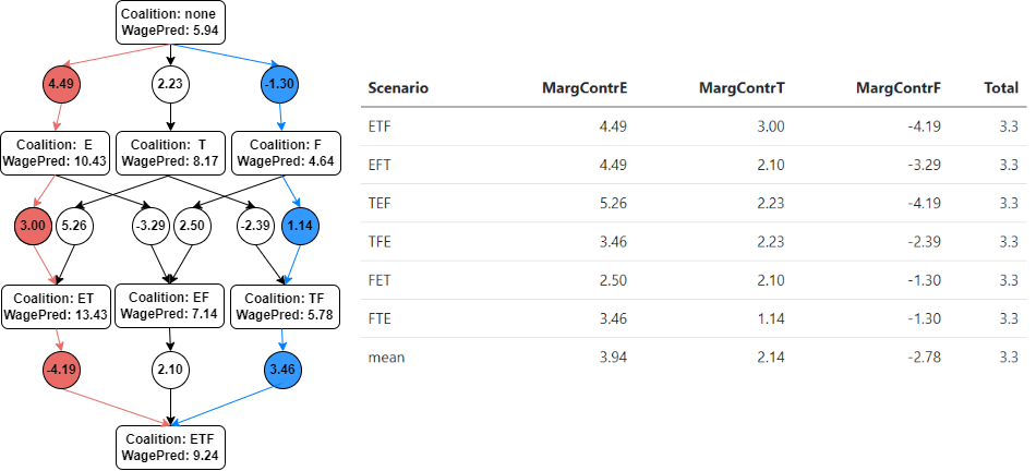
FIGURE 11.6: Deriving SHAP Values for Observation Helga
The entries of each row in the table show the marginal contributions of the related predictor variable for the scenario. Each marginal contribution is the difference between two coalitions — one before the related predictor variable was added and one afterward.
For example, the sixth row in the table in Figure 11.6 represents the blue path through the flow chart. The marginal contribution of \(Educ=17\) is \(3.46\). The predictor value for \(Educ\) was added at the end of the blue path leading to Coalition: ETF. The coalition without \(Educ=17\) (Coalition: TF), contained only the predictors \(Tenure\) and \(Female\).
The Coalition: TF without Education leads to a predicted wage of \(5.78\). The Coalition: TEF that includes Education leads to a predicted wage of \(9.24\). Therefore, including \(Educ=17\) in the wage prediction increased the predicted wage by $3.46 \((9.24-5.78)\) — which is the marginal contribution of \(Educ=17\) for the blue path (Scenario TEF).
The marginal contribution of \(Tenure\) for the scenario in the sixth row in the table can be calculated in a similar way. \(Tenure\) was added second along the blue path, and the difference between the wage prediction from the Coalition: TF (including \(Tenure=18\)) and Coalition: F (without \(Tenure\)) is \(1.14\) \((5.78-4.64)\).
The third value in the sixth row of the table represents the marginal contribution of \(Female=1\). The predictor value \(Female=1\) was considered first for the step-wise wage prediction along the blue path. The marginal contribution of \(Female=1\) is the difference between Coalition: F and Coalition: none \((4.64-5.94=-1.3)\).
Marginal contributions for other paths through the flow chart in Figure 11.6 can be calculated in a similar way. You find them in the table to the right of the flow chart.
To summarize, the marginal contribution of \(Educ=17\), \(Tenure=18\), and \(Female=1\) for the scenario, where the step-wise prediction was performed in the order F, TF, and ETF, are:
\[\underbrace{3.46}_{MargContrE}+ \underbrace{1.14}_{MargContrT} + \underbrace{(-1.30)}_{MargContrF} =\underbrace{3.3}_{MargContrAll}\]
You can see that the marginal contributions add up to \(3.3\), which is the same for all orderings (all rows). This value represents the cumulative contribution from all three predictor variables to the predicted wage. We can show this by calculating the difference between Coalition: ETF, where all predictor variable values are considered, and Coalition: none, where no predictor variable is considered:
\[\underbrace{9.24}_{\mbox{Coalition: ETF}}- \underbrace{5.94}_{\mbox{Coalition: none}} = \underbrace{3.3}_{\mbox{MargContrAll}}\]
How to predict the wage for the coalitions in Figure 11.6?
We mentioned before that the wage prediction for Helga’s wage based on all three predictor variable values could be calculated based on the fitted Random Forest model from Section 11.4:
CoalitionETF=predict(WfModelWageRF, new_data=ObsHelga)
cat("Helga's predicted wage from Coalition ETF is:",
    round(CoalitionETF[[1]],2))
## Helga's predicted wage from Coalition ETF is: 9.24To predict the wage for Coalition: none at the top of the flow chart in Figure 11.6, we have to consider that no information about Helga can be used for this coalition. In the absence of any information, the mean is often a reasonable way to predict a variable. Therefore, we use the mean of the training data for the wage prediction from Coalition: none:
CoalitionNone=mean(DataTrain$Wage)
cat("Helga's predicted wage for Coalition `none` is:",
    round(CoalitionNone,2))
## Helga's predicted wage for Coalition `none` is: 5.94Generating the predictions for Helga’s wage for the remaining six coalitions is a bit more tricky, and we will talk about it a little later.
Instead, we use the table in Figure 11.6 to calculate SHAP values for the predictor variables. Because all possible predictor orders have been considered in the rows of the table, we can calculate the overall contribution of \(Educ=17\), \(Tenure=18\), and \(Female=1\) to the wage prediction as the mean of the columns \(MargContrE\), \(MargContrT\) and \(MargContrF\). You can find the resulting SHAP values in the “mean” row of the table in Figure 11.6.
It is a very useful property of the SHAP methodology that the SHAP values always add up to the cumulative contribution of all predictor variables:
\[\underbrace{3.94}_{\mbox{SHAP Educ=17}}+ \underbrace{2.14}_{\mbox{SHAP Tenure=18}} + \underbrace{(-2.78)}_{\mbox{SHAP Female=1}} =\underbrace{3.3}_{\mbox{SHAP Cummalitiv}}\]
We can use the SHAP values from the equation above to interpret the results from the SHAP approach: The fact that Helga has a high education (\(Educ=18\)) contributes $3.94 to her predicted wage, the fact that she has a long tenure (\(Tenure=18\)) contributes $2.14, and the fact that she is female \((Female=1)\) contributes negative $2.78 to her predicted wage.110 All these contributions add up to \(3.3\) and explain why Helga’s wage is $3.30 higher than the wage of an average worker.
Predicting wage for the remaining six coalitions in Figure 11.6:
We have already explained that the predicted wage for Coalition: none is calculated as the mean wage from the observations in the training dataset. We also showed that the wage prediction that uses all predictor variables (Coalition: ETF) could be calculated as the prediction from the analyzed machine learning model (the Random Forest Model from Section 11.4 in our case).
To calculate the predictions for the six remaining coalitions in the flow chart in Figure 11.6, we used a very simplified approach.
To create the predictions for Coalition: E, Coalition: T, and Coalition: F, we created three new Random Forest models designed for one predictor variable each. Then we fitted each of the three Random Forest models to the training data for the predictor variables \(Educ\), \(Tenure\), and \(Female\), respectively. Afterward, we used the three fitted Random Forest models to create the three predictions for Helga’s wage based on \(Educ=17\) (Coalition: E), \(Tenure=18\) (Coalition: T), and \(Female=1\) (Coalition: F).
For the wage predictions for Coalition: ET, Coalition: EF, and Coalition: TF, we proceeded in a similar fashion: We created three new Random Forest Models designed for two predictors each and then fitted each model with the related two predictor variables from the training dataset (\(E T\), \(E F\), and \(T F\)). As before, we used the corresponding predictor values from the observation Helga to generate the wage predictions for the three coalitions.
The advantage of this simplified approach is that it is possible to showcase the approach in an R script (see the Digital Resource Section 11.10 for a link to a blog article that describes the approach in detail and provides the related R script.). The disadvantage is that this simplified approach has a conceptual and a computational drawback:
- The Conceptual Drawback:
-
Our goal is to generate SHAP values to explain the Random Forest model from Section 11.4 — the one that was used for Coalition: ETF in Figure 11.6. However, for the six coalitions that use only one or two predictor variables, we used similar but still different Random Forest models because these Random Forest models were designed for one and two predictor variables. This is conceptually problematic.
- The Computational Drawback:
-
The simplified approach is not scalable. Using three predictor variables led to eight coalitions to consider. One was based on the Random Forest model we wanted to explain (Coalition: ETF), and for another one, we used the mean of the outcome variable from the training dataset as the predicted wage. That left six models for which we had to design and train six new Random Forest models. Creating six new Random Forest models is not a significant computational problem. However, the number of coalitions \((NCoalitions)\) grows exponentially with the number of predictor variables \((NPredVar)\):
For three predictor variables, we need eight coalitions \((2^3=8)\), but for 20 predictor variables, we need to design and fit more than 1 million Random Forest models \((2^{20}=1,048.576)\). The computational cost of this is excessively high.
Fortunately, many highly effective computer algorithms exist to estimate SHAP values to explain the predictions of machine learning models. For example, KernelSHAP, a kernel based SHAP values model, was developed by S. Lundberg and Lee (2017). Later, S. M. Lundberg, Erion, and Lee (2019) developed TreeSHAP, a very effective model-specific algorithm limited to tree-based models. Both algorithms are beyond the scope of this book, but an introduction and a comparison of both models can be found in O‘Sullivan (2022a).
In the following section, you will use the DALEX and the DalexExtra R packages to estimate SHAP values to interpret the results from the vaccination project that you used in the interactive Section 10.4.2. Below, we present the basic ideas of the DALEX algorithm.
DALEX, like our simplified approach, uses the mean of the outcome variable for the first coalition (Coalition: none) and the final model to predict the outcome for the last coalition (Coalition: ETF). For all other coalitions, DALEX also uses the final machine learning model, which avoids designing and fitting new machine learning models for every coalition.
However, using a model that is designed to use all predictor variables for a coalition that considers less than all predictors raises the question of which values to use for the variable(s) not covered by this coalition. For example, if we want to predict Coalition: TF from Figure 11.6, we would use the \(Tenure=18\) and \(Female=1\) values from observation Helga, but what do we use for \(Educ\)?
The DALEX solution is to substitute all \(Tenure\) and \(Female\) values in the training dataset observations with Helga’s values \(Tenure=18\) and \(Female=1\), but leave all values for \(Educ\) untouched. Then, based on the new dataset, the Random Forest model creates predictions for all observations. This way, the values from observation Helga (\(Tenure=18\) and \(Female=1\)) are utilized to predict, and the distribution of the missing variable \((Educ)\) is preserved.
After all predictions for the new dataset have been created, the prediction for the Coalition: TF is the mean of the predictions from the newly created dataset. The predictions for other coalitions are calculated in a similar way.
This algorithm works well when there are not too many predictor variables, and it does not use extra computing time to fit extra Random Forest models. However, it needs to predict as many observation as in the training dataset for each coalition. Given that the number of coalitions exponentially grows with the number of predictor variables (see Equation (11.1)), this can turn into a computational problem.
To address this problem, DALEX allows you to limit the number of paths through a flow chart like the one shown in Figure 11.6. Since a path through the flowchart is the same as a row in the table next to it, DALEX chooses a limited number of random rows from the table and then only calculates predictions for the required coalitions. The number of rows (paths) can be set with an argument.
In the next interactive section, you can use DALEX to interpret the predictions for the vaccination project that you used before in the interactive Section 10.4.2 to predict U.S. counties’ vaccination rates with a Random Forest model.
11.7.3 🧭Project: Apply the SHAP Algorithms in a Project
At the end of the previous section, we explained how DALEX approximates SHAP values. Here, you will work with a real-world application that uses the same Random Forest model and the same data used in Section 10.4.2 predicting the U.S. continental counties’ vaccination rates during the COVID-19 pandemic.
We will show how you can use tidymodels with the DALEX and DALEXtra packages to generate SHAP values to interpret the prediction results for a specific U.S. county.
Afterward, in the interactive Section 10.4.2 you can use the provided R code to create SHAP values for any county and interpret the results.
We start by reviewing the data processing for the Random Forest workflow used in Section 10.4.2.
Below, the libraries and data are loaded, and the data are split into training and testing data:
library(rio); library(janitor); library(tidymodels)
library(DALEX); library(DALEXtra)
DataVax=import("https://ai.lange-analytics.com/data/DataVax.rds") |>
              select(PercVacFull, PercRep,
                     PercAsian, PercBlack, PercHisp,
                     PercYoung25, PercOld65,
                     PercFoodSt, Population) |>
              mutate(Population=frequency_weights(Population))
set.seed(2021)
Split85=DataVax |> initial_split(prop=0.85,
                                 strata=PercVacFull,
                                 breaks=3)

DataTrain=training(Split85)
DataTest=testing(Split85)
Recall from Section 10.4.2 that \(Population\) is not a predictor variable. Instead, we use the population of each U.S. county to weigh the county’s observations. This is why the variable \(Population\) is marked as frequency_weights.
In the R code below, we create the recipe, the model design, add both to the workflow, and fit the workflow with the training data:
set.seed(2021)
RecipeVax=recipe(PercVacFull~., data=DataTrain)

library(parallel)
ModelDesignRandFor=rand_forest(min_n=5, mtry=2, trees=2000) |>
                   set_engine("ranger",  num.threads=detectCores()) |>
                   set_mode("regression")

WfModelVax=workflow() |>
           add_model(ModelDesignRandFor) |>
           add_recipe(RecipeVax) |>
           fit(DataTrain)
Above, we use parallel processing to speed up the process to create a fitted Random Forest workflow. We set the number of threads to run parallel to num.threads=detectCores(), which determines that we run as many threads in parallel as the computer has processing cores.
Next, we build the explainer object for the SHAP values methodology. As explained in Section 11.5, the DALEX package, like many other R interpretation packages, stores information about the model to be analyzed, the training dataset, and additional information for the respective methodology in a so-called explainer object. This explainer object is then used as an input for the actual analysis command, which performs the analysis.
DataTrainPredOnly=select(DataTrain, -PercVacFull, -Population)

ExplainerRandForest=explain_tidymodels(WfModelVax,
                    data=DataTrainPredOnly,y=DataTrain$PercVacFull,
                    verbose=FALSE)
In the R code above, we use the command explain_tidymodels() from the DALEXtra package, which allows us to create the explainer object directly from the tidymodels workflow WfModelVax. The command explain_tidymodels() requires that the training data assigned to the data= argument contain exclusively the prediction variables. This is why we first used select() to create a data frame containing only the predictor variables before creating the explainer object. The outcome variable \(PercVacFull\) (a county’s rate of fully vaccinated adults) is provided through the y= argument, and verbose=FALSE suppresses message output.
Now, everything is ready to calculate the SHAP values for one of the observations with the predict_parts() command. In the interactive part of this section further below, you can create and interpret SHAP values for almost any continental U.S. county, but for now, we keep it simple and choose Los Angeles County, CA.
In the DataVax data frame, Los Angeles has a CountyID=133, which means that the Los Angeles observation is in the \(133rd\) row of the dataset.

FIGURE 11.7: SHAP Values for Los Angeles County, CA
The plot in Figure 11.7 was created with the predict_parts() command. In Figure 11.7, the bars indicate the SHAP values for the respective predictor variables, with the label at the vertical axis indicating the value of the respective predictor variable in Los Angeles County. The box plots overlaying each bar indicate the distribution of the SHAP values for the \(25\) randomly chosen scenarios (orderings of predictor variables). You find the R code that generates Figure 11.7 below:
set.seed(2021)
CountyID=133
SHAPObject=predict_parts(
    explainer=ExplainerRandForest,
    new_observation=DataVax[CountyID,],
    type="shap", B=25)

plot(SHAPObject)
We use the argument new_observations=DataVax[CountyID,]) to create SHAP values for the observation Los Angeles. Also, the explainer object that we created above is assigned to the argument explainer= and the argument B=25 determines that we want to use only 25 scenarios (different orderings of the seven predictor variables) out of \(2^7=128\) possible orderings.111
The SHAP values and the values of the predictor variables for Los Angeles County that are visualized in Figure 11.7, are displayed in Table 11.1 in columns \(SHAP\) and \(County\).112 We also added the U.S. values for the predictor variables in column \(Nation\). These values were not used in any way to create the SHAP values, but they will help later to interpret the SHAP values.
| Variable | SHAP | County | Nation |
|---|---|---|---|
| PercAsian | 0.074 | 0.144 | 0.063 |
| PercBlack | 0.001 | 0.078 | 0.136 |
| PercFoodSt | 0.011 | 0.087 | 0.115 |
| PercHisp | 0.001 | 0.485 | 0.191 |
| PercOld65 | -0.011 | 0.175 | 0.173 |
| PercRep | 0.116 | 0.277 | 0.478 |
| PercYoung25 | -0.002 | 0.095 | 0.310 |
| a Sources: column SHAP, column County, predicted U.S. Vac. Rate, and Coalition `none’ are extracted from the SHAP object. | |||
| b Source PercRep Nation: Cook Political Report, https://www.cookpolitical.com/2020-national-popular-vote-tracker. Biden=0.513, Trump=0.469 was transformed to PercRep=0.469/(0.513+0.469) to account for the fact that we considered only two parties. | |||
| c Sources column Nation: Census, United States Population, estimates base, July 1, 2022, (V2022), https://www.census.gov/quickfacts/fact/table/US. |
As shown in Section 11.7.2 the difference between the prediction from the Random Forest model for Los Angeles County \((PredVac_{LA}=0.696)\)113 and Coalition: none \((CoalNone=0.507)\)114 equals the sum of all SHAP values:
\[\begin{eqnarray*} \overbrace{0.696}^{PredVac_{LA}}- \overbrace{0.507}^{CoalNone} &=&0.189\\ &&\\ \underbrace{0.074}_{ShapAsian}+ \underbrace{0.001}_{ShapBlack}+ \underbrace{0.011}_{ShapFoodSt}+ \underbrace{0.001}_{ShapHisp}+&&\\ \underbrace{-0.011}_{ShapRep}+ \underbrace{0.116}_{ShapOld65}+ \underbrace{-0.002}_{ShapYoung25} &=&0.19 \end{eqnarray*}\]Since \(CoalNone\) (Coalition: none) does not consider the impact of any predictor variable and since the prediction from the Random Forest model considers all predictor variables, the difference between \(PredVac_{LA}\) and \(CoalNone\) reflects the cumulative contribution from all predictor variables on the prediction. The individual SHAP values assign shares of this cumulative contribution to the individual predictor variables.
With this knowledge, we can explain the SHAP values in Figure 11.7. However, we will only explain the largest SHAP values. This is good practice because SHAP values vary depending on which scenarios (predictor variable orderings) are randomly selected by the algorithm. Thus, for small SHAP values, a variation in value can lead to a change of sign of the SHAP value and, therefore, change the direction of how the related variable impacts the prediction.
Below we interpret the SHAP values for \(PercRep\), \(PercAsians\), and \(PercFoodSt\) and \(PercOld65\):
The Republican vote \((PercRep)\) in Los Angeles County is lower than in the nation (see Table 11.1). This leads to a positive SHAP value, increasing the vaccination rate by 11.6%.
The proportion of Asians \((PercAsian)\) in Los Angeles County is greater than in the nation (see Table 11.1). This leads to a positive SHAP value, increasing the vaccination rate by 7.4%.
The proportion of food stamp recipients \((PercFoodSt)\) in Los Angeles County is smaller than in the nation (see Table 11.1). This leads to a positive SHAP value, increasing the vaccination rate by 1.1%.
The interpretation of \(PercOld65\) is unclear. Los Angeles has about the same proportion of older people as the nation (see Table 11.1). Because of a higher COVID-19 hospitalization and death risk, we know that older people tend to have a lower vaccination hesitancy.115 However, in Figure 11.7, the SHAP value indicates that the predicted vaccination rate decreased by 1.1%. In addition, the whiskers from the box plot for \(PercOld65\)116 in Figure 11.7 overlap positive and negative values, making it difficult to decide in which direction this variable influences the true vaccination rate.
The interpretation of the variables \(PercRep\), \(PercAsian\), and \(PercFoodSt\) makes sense because we know that Republican voters are more vaccination hesitant, Asians are less vaccination hesitant, and lower income (i.e., more food stamp recipients) is believed to lead to higher vaccination hesitancy.117
Now that you know how to interpret the SHAP diagram for Los Angeles County, you should look at other U.S. counties.
The interactive application below allows you to choose a continental U.S. County and then display the SHAP diagram with the table we used for Los Angeles County. This is an excellent exercise to learn how to interpret SHAP values and the related diagrams.
Interactive Section
In this section, you will find content together with R code to execute, change, and rerun in RStudio.
The best way to read and to work with this section is to open it with RStudio. Then you can interactively work on R code exercises and R projects within a web browser. This way you can apply what you have learned so far and extend your knowledge. You can also choose to continue reading either in the book or online, but you will not benefit from the interactive learning experience.
To work with this section in RStudio in an interactive environment, follow these steps:
Ensure that both the
learnRand theshinypackage are installed. If not, install them from RStudio’s main menu (Tools -> Install Packages \(\dots\)).Download the
Rmdfile for the interactive session and save it in yourprojectfolder. You will find the link for the download below.Open the downloaded file in RStudio and click the
Run Documentbutton, located in the editing window’s top-middle area.
For detailed help for running the exercises including videos for Windows and Mac users we refer to: https://blog.lange-analytics.com/2024/01/interactsessions.html
Do not skip this interactive section because besides providing applications of already covered concepts, it will also extend what you have learned so far.
Below is the link to download the interactive section:
https://ai.lange-analytics.com/exc/?file=17-InterpretExerc100.Rmd
To generate a SHAP diagram for a continental U.S. county of your choice, you have to proceed in two steps:
Step 1:
The code chunk below helps you to find the \(CountyID\) for the county you are interested in. You need the \(CountyID\) for the next step below to create the SHAP diagram.
To find the \(CountyID\), substitute the \(\dots\) in the code block below with the name or part of the name of the county you are interested in (do not include the word “county”!):
CountySearchStr="..."

######## Do not change code below this line ###################
VecMatchingCountyNames=grep(CountySearchStr, DataCountyInfo$County,
                            ignore.case=TRUE)
VecMatchingFIPS=grep(CountySearchStr, as.character(DataCountyInfo$Fips),
                     ignore.case=TRUE)
VecMatching=sort(c(VecMatchingCountyNames, VecMatchingFIPS))
unique(DataCountyInfo[VecMatching,])
DataMatchingCounties=DataCountyInfo[VecMatching,]
print(DataMatchingCounties)
Step 2:
Here you can create the SHAP diagram and the related table with some extra info. All you have to do is substitute the \(\dots\) in the code block below with the CountyID that you got in Step 1 (the number only; no quotes).
Executing the code takes a while (depending on your computer between 1 – 8 minutes). You can change the B= argument (the number of scenarios to be calculated) to a lower value to speed things up, but the trade-off is a lower precision.
After you get the results, take a moment to interpret the SHAP values and decide which SHAP values should not be interpreted (hint: take the value of the SHAP value and the box plot into account).
CountyID= ...

set.seed(2021)

SHAPObject=predict_parts(
           explainer=ExplainerRandForest,
           new_observation=DataVax[CountyID,],
           type="shap", B=25)

### Do not change code below this line ##########

CountyPred=round(attr(SHAPObject, "prediction"), 3)
VacRateCoalNone=round(attr(SHAPObject, "intercept"), 3)
TitleShap=paste(substr(DataCountyInfo[[CountyID, 3]], 1, 15),
                "(PredVac=", CountyPred,
                "Coalition: none =", VacRateCoalNone,")")

SHAPObject$label=TitleShap
plot(SHAPObject)

ShapTable=SHAPObject |>
          as_tibble() |>
          filter(B==0) |>
          select(Variable=variable_name, SHAP=contribution,
                 County=variable_value) |>
          mutate(Nation=c(0.063, 0.136, 0.115, 0.191, 0.173,
                          0.478, 0.310)) |>
          mutate(County=round(as.numeric(County), 3))|>
          mutate(SHAP=round(SHAP, 3))

kable(ShapTable, caption=TitleShap) |>
kable_styling(bootstrap_options=c("striped", "hover"),
              position="center", full_width=T)
11.8 Local Interpretable Model-agnostic Explanations (LIME)
LIME (Local Interpretable Model-agnostic Explanations) is, as the name suggests, a local and model-agnostic interpretation algorithm. It was developed in 2016 by Ribeiro, Singh, and Guestrin (2016).
Because LIME is a local interpretation method, the goal is to explain the prediction for a specific observation from a complex model such as Neural Network or Random Forest model. However, instead of interpreting the complex model directly, LIME uses a simpler but interpretable model such as linear OLS to interpret the observation of interest.
The underlying assumption is that the complex model (e.g., Random Forest) can be approximated by the simpler model (e.g., OLS) in the neighborhood of the observation of interest. Neighborhood means, in this context, similar values for the predictor variables as the observation of interest. In short:
LIME uses an interpretable machine learning model (e.g., OLS) to approximate a complex machine learning model in the neighborhood of the observation of interest.
The three steps below will give you an idea how LIME accomplishes this task in R.118
- Step 1:
-
Because not enough observations might be available in the neighborhood of the observation of interest, LIME creates artificial predictor variable values with similar values as the observation of interest (5,000 observations by default).
For each continuous predictor variable LIME analyzes the distribution of the training data using quartile bins.119 Then, for each continuous predictor variable, random values are generated that match the distribution of the training data. However, only the values that fall in the same quartile bin as the observation of interest are used to create the artificial observations. This ensures that no values are used that differ too much from the observation of interest.
For categorical variables such as \(Female\), only the category that coincides with the the one of the observation of interest (\(Female=1\) in our example) is used when artificial observations are created.
- Step 2:
-
Since we want to explain the predictions of the complex model (e.g., Random Forest) in the neighborhood of the observation of interest, we need to create these predictions with the Random Forest model (the complex model) from the artificial observations.
- Step 3:
-
Finally, the dataset created in Step 2 is used with OLS (or another interpretable model) to analyze the impact of the predictor variables on the predictions from the Random Forest (the complex model). The artificial observations are weighted based on their similarity to the observation of interest. Similar observations receive a high weight, while dissimilar observations get a low weight.120 This ensures that the OLS model focuses more on observations closer to the observation of interest.
The result from the OLS model provides an estimate of how much each predictor variable value from the observation of interest contributes to the related prediction.
Now, let us see LIME in action. We again use the results from the Random Forest model to predict wages (the fitted workflow; WfModelWageRF) that was introduced in Section 11.4 together with the observation for Helga, which is the observation of interest:
## # A tibble: 1 × 5
##   .pred  Wage  Educ Tenure Female
##   <dbl> <dbl> <dbl>  <dbl> <fct>
## 1  9.24   8.9    17     18 1
In the code block below, the lime() command creates an explainer object, which only includes the Random Forest model (extracted from the fitted workflow model by extract_fit_engine()), the training data, and statistics calculated from the training data.
library(lime)
set.seed(777)
ExplainerLime=lime(DataTrainPredOnly,
                   model=extract_fit_engine(WfModelWageRF))
Again, the explainer object ExplainerLime is only a container that contains the prediction model together with statistics about the training data.
In the code block below this explainer object is entered as an argument into the lime::explain() command which executes the LIME interpretation.121
library(lime)
set.seed(777)
ObsHelgaPredOnly=select(ObsHelga, Educ,Tenure,Female)
LimeResults=lime::explain(ObsHelgaPredOnly, explainer=ExplainerLime,
                          n_features=3)
Note that before executing lime::explain(), we used select() to create a data frame that exclusively contains the predictor variables. This is needed because the lime::explain() command expects that type of data frame. We also set the argument n_features=3 because we want to consider all three predictor variables. For an analysis with many predictor variables, using only a subset of predictors is reasonable.
The OLS prediction results are saved in the R object LimeResults. To visualize the results in Figure 11.8 we use:
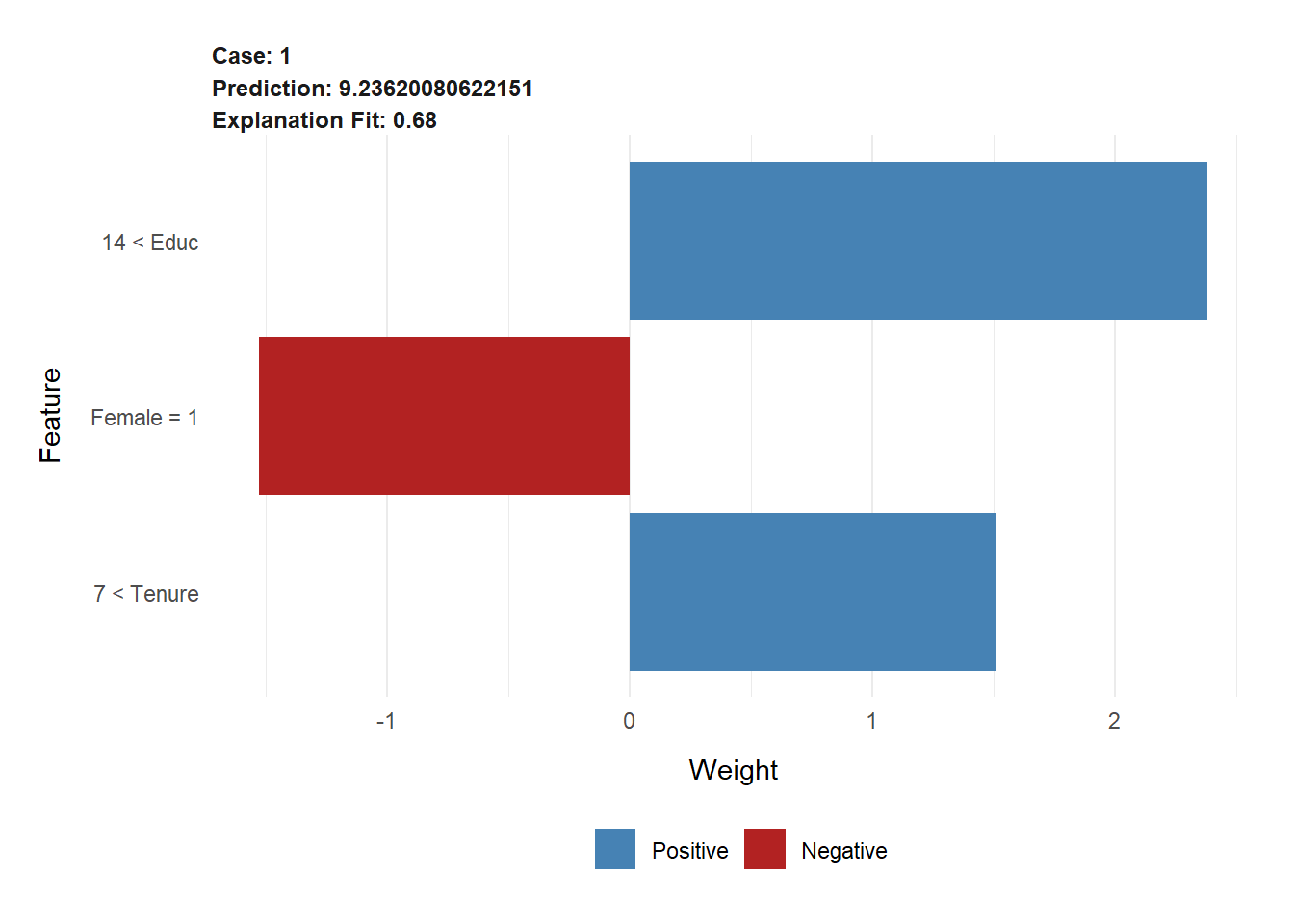
FIGURE 11.8: LIME Results for Observation Helga from the Wage Model
The bar diagram in Figure 11.8 shows the results of the LIME analysis. Each bar quantifies the contribution from Helga’s predictor variable values \(Educ=17\), \(Tenure=18\), and \(Female=1\) to the predicted wage from the linear OLS model. The latter can be retrieved from the LIME object:
## Helga's predicted wage from the OLS model is: 7.82In the upper-left corner of the LIME plot in Figure 11.8, you find the \(r^2\) for the linear OLS model \((r^2=0.68)\) and the predicted wage for Helga from the original Random Forest model \((.pred=9.24)\).
The bars in the diagram of Figure 11.8, together with the vertical axis labels, can be interpreted as follows:
The fact that Helga has a high education \((Educ=17)\) puts her in the upper quartile \((Educ>14)\), and it contributes about $2.50 (exact value is 2.38) to her predicted wage.
The fact that Helga has a high tenure \((Tenure=18)\) puts her in the upper quartile \((Tenure>7)\), and it contributes $1.50 (exact value is 1.51) to her predicted wage.
The fact that Helga is female, deducts about $1.50 (exact value is 1.53) from her predicted wage.
If we retrieve the intercept from the linear OLS prediction from the LIME object
## The Intercept from the linear OLS model is: 5.463 5.463 5.463we can show that the Intercept, together with the quantitative impacts from Helga’s predictor variables values, add up to the prediction of the linear OLS model (\(.predOLS\)):
\[\underbrace{5.46}_{Intercept} + \underbrace{2.38}_{ContrEduc}+ \underbrace{1.51}_{ContrTenure}+ \underbrace{-1.53}_{ContrFem}= \underbrace{7.82}_{\widehat{.predOLS}}\]
11.9 When and When Not to Use Interpretation
We should always use interpretation algorithms to better understand why our model predicts certain outcomes and quantify the impact of individual and cumulative predictions. It is also a good practice to use various interpretation methodologies together to check if the results are similar.
For choosing an appropriate interpretation methodology, it is important to consider which type of questions we can answer with which methodology. Below is a list that gives some pointers:122
Ceteris Paribus Plots:
- Can be used to quantify the impact of variable change for a specific observation.
- Model-agnostic and local.
Partial Dependence Plots:
- Can be used to quantify the impact of variable change for a complete model, but they are not specific to individual observations.
- Model-agnostic and global.
Variable Importance Plots (VIP)
- Analyze the importance of variables but not the quantitative impact on the predictions.
- VIPs are well suited for deciding which predictor variables should stay in a model and which ones should be dropped.
- Model-specific (model-agnostic versions also exist) and local.
SHAP Values
- Quantify the impact of predictor variable values on a specific prediction.
- Model-agnostic and global.
LIME:
- Uses an interpretation proxy model like linear OLS to quantify the impact of predictor variable values on a specific prediction.
- Can be used together with SHAP values to verify if the results from both methodologies match.
- Can be used as an alternative method to SHAP values when estimating SHAP values is computationally too expensive.
- Model-agnostic and local.
11.10 Digital Resources
Below you will find a few digital resources related to this chapter such as:
- Videos
- Short articles
- Tutorials
- R scripts
These resources are recommended if you would like to review the chapter from a different angle or to go beyond what was covered in the chapter.
Here we show only a few of the digital resourses. At the end of the list you will find a link to additonal digital resources for this chapter that are maintained on the Internet.
You can find a complete list of digital resources for all book chapters on the companion website: https://ai.lange-analytics.com/digitalresources.html
The Ultimate Guide to PDPs and ICE Plots
A comprehensive tutorial by Conor O’Sullivan in Towards Data Science. It describes the intuition and maths behind Partial Dependence Plots (PDP) and Individual Conditional Expectation (ICE) plots.

Machine Learning Made Simple: Permutation Based Feature Importance
A YouTube video by Davnsh Senthi. In the video, he explains the underlying idea of Permutation Based Feature Importance with an example step by step.

How to Create Your Own SHAP Algorithm in R
This blog post from the AI blog of Carsten Lange shows how you can create a simplified SHAP value approximation in R.
The post explains the code, talks about drawbacks, and provides alternatives that are available as R packages. The related R script is also provided.

LIME: Explain Machine Learning Predictions: Intuition and Geometrical Interpretation
An article in Towards Data Science by Giorgio Visani. The article explains visually and intuitively how LIME works.

More Digital Resources
Only a subset of digital resources is listed in this section. The link below points to additional, concurrently updated resources for this chapter.

References
The coefficients for the predictive variables show how a change of a variable will impact the prediction, the P-values indicate the significance of the prediction, and the overall contribution of the predictor variables is additive separable. You can find more about the interpretation of OLS and its limits in Wooldridge (2020).↩︎
A good overview about the interpretability of machine learning models and the related algorithms is provided in the book by Molnar (2020).↩︎
Later in the interactive Section 11.7.3, you will work with an up-to-date real-world model to predict vaccination rates during the COVID-19 pandemic.↩︎
The
wooldridgepackage (Shea (2023)) provides various datasets related to an econometrics textbook (Wooldridge (2020)). It is published on CRAN under a GLT3 license.↩︎This wage seems to be very low, but consider that the wage data are from 1976 (see Shea (2023)).↩︎
In general, allowing only one variable to change and leaving all other variables constant is called ceteris paribus (Latin for: everything else the same). Thus, the name of the plot.↩︎
O‘Sullivan (2022b) compares the SHAPLEY and the SHAP approaches and provides mathematical foundation for both approaches. He also briefly discusses how SHAP values can be computationally approximated.↩︎
The fact that Helga’s sex reduces her wage by almost $3 should not come as a surprise. The data are from 1976 and reflect sex discrimination during that time. To analyze sex discrimination in present times, we could use a similar methodology based on most recent data.↩︎
The related values were extracted from the SHAP Object:
SHAPObject\(|>\) as_tibble() \(|>\)filter(B==0)\(|>\)select( SHAP=contribution, County=variable_value).↩︎The value was extracted from the SHAP object
SHAPObjectwith:round(attr(SHAPObject, "prediction"),3).↩︎The value was extracted from the SHAP object
SHAPObjectwith:round(attr(SHAPObject, "intercept"),3). Note that this value is not equal to the national vaccination rate becauseCoalition: noneis calculated from the average of the training data and not all data. In addition, the average the SHAP algorithm calculates is not weighted with the counties’ population.↩︎The box plot shows the distribution of the SHAP values for \(PercOld65\) for the randomly selected scenarios. We chose 25 scenarios (
B=25).↩︎The R implementation is explained in detail in Hvitfeldt, Pedersen, and Benesty (2022).↩︎
Quartiles are the default, but other quantiles can be set with the
n_bins=argument in thelime()command.↩︎To measure the similarity a metric akin to Euclidean Distance is used (see Section 4.5.1 for Euclidean Distance). By default, LIME uses Gower Distance, which, compared to Euclidean Distance, provides a better measure of dissimilarity between data points with mixed types of predictor variables.↩︎
We prefixed the
explain()command withlime::to determine that we would like to use theexplain()command from thelimepackage and not from another package such as thetidyversepackage or theDALEXpackage.↩︎See Molnar (2020) for a detailed overview of interpretation methodologies.↩︎