Chapter 4 k-Nearest Neighbors — Getting Started
This is an Open Access web version of the book Practical Machine Learning with R published by Chapman and Hall/CRC. The content from this website or any part of it may not be copied or reproduced. All copyrights are reserved.
If you find an error, have an idea for improvement, or have a question, please visit the forum for the book. You find additional resources for the book on its companion website, and you can ask the experimental AI assistant about topics covered in the book.
If you enjoy reading the online version of Practical Machine Learning with R, please consider ordering a paper, PDF, or Kindle version to support the development of the book and help me maintain this free online version.
In the previous chapter, you learned the basics about R and RStudio. Now, you are probably keen to apply your knowledge to create a machine learning model. Therefore, we will postpone covering key concepts of machine learning models to Chapter 5 and jump right in to create our first machine learning model.
We start with a k-Nearest Neighbors model in Section 4.5 predicting whether a wine is red or white based on only two chemical properties (acidity and sulfur dioxide). This model allows us to introduce the underlying idea of k-Nearest Neighbors and in addition some essential machine learning concepts such as:
Splitting the available observations into training and testing data (see Section 4.3).
The concept of scaling (see Section 4.6).
Pre-processing data and designing machine learning models with the
tidymodelspackage (see Section 4.7.1).Interpreting a confusion matrix (see Section 4.8).
The last two sections 4.9 and 4.10 are designed to be hands-on and interactive. In Section 4.9, you will write R code in RStudio to improve the model from Section 4.5 by adding additional chemical properties as predictor variables. In Section 4.10, you will work on a different project to apply Optical Character Recognition (OCR) to detect digits between 0 – 9 from handwritten notes using k-Nearest Neighbors.
4.1 Learning Outcomes
This section outlines what you can expect to learn in this chapter. In addition, the corresponding section number is included for each learning outcome to help you to navigate the content, especially when you return to the chapter for review.
In this chapter, you will learn:
How to split your observations into training and testing data and why this is essential (see Section 4.3 for an introduction. The details will be covered in Chapter 6).
What is the underlying idea of k-Nearest Neighbors (see Section 4.5).
How similarity can be measured with Euclidean Distance (see Section 4.5).
Why scaling predictor variables is essential for some machine learning models (see Section 4.6).
Why the tidymodels package makes it easy to work with machine learning models (see Section 4.7.1).
How you can define a recipe to pre-process data with the
tidymodelspackage (see Section 4.7.1).How you can define a model design with the
tidymodelspackage (see Section 4.7.1).How you can create a machine learning workflow with the
tidymodelspackage (see Section 4.7.1).How metrics derived from a confusion matrix can be used to evaluate prediction quality (see Section 4.8).
Why you have to be careful when interpreting accuracy, when working with unbalanced observations (see Section 4.8).
How a machine learning model can process images and how OCR works (see the project in Section 4.10).
4.2 R Packages Required for the Chapter
This section lists the R packages that you need when you load and execute code in the interactive sections in RStudio. Please install the following packages using Tools -> Install Packages \(\dots\) from the RStudio menu bar (you can find more information about installing and loading packages in Section 3.4):
The
riopackage (Chan et al. (2021)) to enable the loading of various data formats with oneimport()command. Files can be loaded from the user’s hard drive or the Internet.The
janitorpackage (Firke (2023)) to rename variable names to UpperCamel and to substitute spaces and special characters in variable names.The
tidymodelspackage (Kuhn and Wickham (2020)) to streamline data engineering and machine learning tasks.The
kableExtra(Zhu (2021)) package to support the rendering of tables.The
learnrpackage (Aden-Buie, Schloerke, and Allaire (2022)), which is needed together with theshinypackage (Chang et al. (2022)) for the interactive exercises in this book.The
shinypackage (Chang et al. (2022)), which is needed together with thelearnrpackage (Aden-Buie, Schloerke, and Allaire (2022)) for the interactive exercises in this book.
- The
kknnpackage (Schliep and Hechenbichler (2016)) to run a k-Nearest Neighbors model.
4.3 Preparing the Wine Dataset
Throughout this chapter, except for Section 4.10, we will work with a publicly available wine dataset that has been used widely in various machine learning competitions and tutorials. This dataset contains 3,198 observations about different wines and was initially developed by Cortez et al. (2009). It includes variables such as a wine’s color, several chemical properties, and an indicator of the quality of the wine.
The goal is to develop a k-Nearest Neighbors model that can predict if a wine is red or white based on its chemical properties. In a first attempt, we will only use a wine’s acidity and its total content of sulfur dioxide as predictor variables.
We start working with the wine dataset in the code block below:
library(tidyverse); library(rio); library(janitor)
DataWine=import("https://ai.lange-analytics.com/data/WineData.rds") |>
         clean_names("upper_camel") |>
         select(WineColor,  Sulfur=TotalSulfurDioxide,  Acidity)

head(DataWine)
## WineColor Sulfur Acidity
## 1 red 37 10.8
## 2 white 213 6.4
## 3 white 139 9.4
## 4 white 90 8.2
## 5 white 183 6.4
## 6 red 38 6.7First, we load the required packages using the library() commands. Then the wine dataset is downloaded from the Internet, and for better readability, variable names are changed to UpperCamel notation using the command clean_names() from the janitor package (see Section 3.6 for details). Next, we use the select() command to ensure that only the variables \(WineColor\), \(Sulfur\) (renamed from \(TotalSulfurDioxide\)), and \(Acidity\) are included in the data frame DataWine.
When working with data to build and test machine learning models, we work with datasets that contain observations. We use these observations for feature engineering, building a model, optimizing the model’s hyper-parameters, and assessing the predictive quality of the final model.
Can we use all of our observations for all of these purposes? The answer is “No” because we cannot use observations to optimize our model and then use the same observations to assess the model’s predictive quality.
Suppose we would use the same observations to optimize the model and assess the model’s predictive quality. Then the assessment would show how well the model approximates the data rather than the model’s ability to predict new data.
To avoid this type of ill-designed assessment, we have to withhold some data that are never used for training or optimizing the model. In other words, we set aside some data the model will never see during development. These data are called testing data, while the data used for training and optimizing the model are called training data.
Kuhn and Silge (2022) use the concept of “spending” observations to explain the concept of training and testing data: Just like you can spend the same dollar bill only once, you can spend (use) an observation from a dataset only once. You can either spend (use) an observation for optimizing a model (the observation becomes part of the training data) or for assessing the final model (the observation becomes part of the testing data) but not for both. Assigning observations to either the training or the testing dataset is usually done randomly.24
Training and Testing Data
When working with data to build machine learning models and evaluate their predictive quality, we split the observations into two different datasets.
- Training data
-
are used to optimize a machine learning model, which includes finding the parameters and hyper-parameters that provide the best promise for a well-performing model.
- Testing data
-
constitute a holdout dataset exclusively used to assess the predictive quality of a machine learning model.
Never use testing data for any kind of optimization!
Why we must follow the above rule strictly will be covered in detail in Chapter 6.
The decision of which proportion should be used for training and which proportion should be withheld for assessment is difficult. As a rule of thumb, about 60% – 85% of the observations should be used for training and the remaining observations for testing. In any case, we have to ensure that the training dataset contains sufficient observations to optimize the model parameters.
Writing R code to randomly assign observations to either the training or testing dataset can be tedious. Fortunately, with the R tidymodels package, randomly splitting a dataset into training and testing data is straightforward.
In the R code block below, we load the tidymodels package and then use initial_split() to define the splitting criteria to assign observations to either the training or the testing dataset. The command intial_split() performs the split, and the results are saved in the R object Split7030. With the commands training(Split7030) and testing(Split7030) in the following two lines, we extract the training and testing data and assign them to the data frames DataTrain and DataTest, respectively:
library(tidymodels);
set.seed(876)
Split7030=initial_split(DataWine,  prop=0.7,  strata=WineColor)

DataTrain=training(Split7030)
DataTest=testing(Split7030)
The set.seed() command in the second line initializes R’s random number generator. This is recommended because we want to avoid creating a setup where we must deal with different training and testing data every time we execute the code. Consequently, we initialize the random number generator using an integer number. This way, every time the intial_split() command is executed (and initialized with “876”), it generates the same random outcome. You can choose the integer in set.seed() as you wish. The argument strata=WineColor ensures that red and white wines in the training and testing data are similarly distributed.
4.4 Visualizing the Training Data
Exploring data visually before running a machine learning model is always a good idea. Figure 4.1 shows a scatter plot of the training data with \(Sulfur\) (total sulfur dioxide; measured in mg/liter) at the horizontal axis and \(Acidity\) (measured as tartaric acid in g/liter) at the vertical axis. The colors of the wines are encoded with red and yellow to mark red and white wines, respectively. We also added a blue point representing a wine with an unknown color.
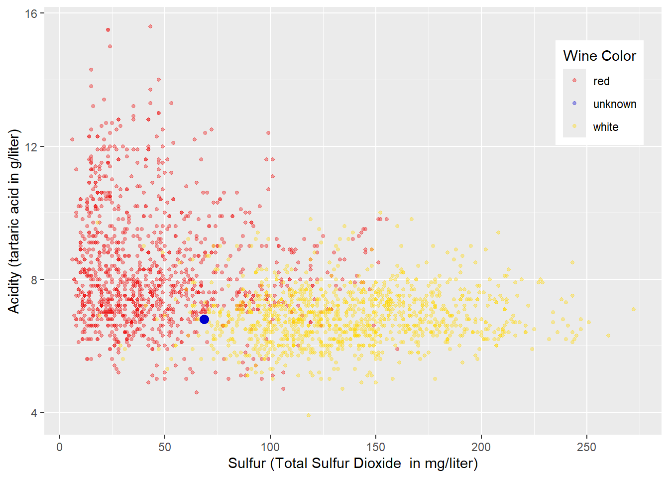
FIGURE 4.1: Acidity and Total Sulfur Dioxide Related to Wine Color
From the plot in Figure 4.1, you can already develop some intuitive approaches for classifying red and white wines before we implement k-Nearest Neighbors.
Before reading on, look at Figure 4.1 and try to develop one or more rules for classifying the wines into “red” and “white”.
In a first attempt, we try to separate the red and white wines exclusively by \(Acidity\) leading to a horizontal decision boundary like in Figure 4.2. A decision value of \(Acidity=8\) looks reasonable. Wines with an acidity less than \(8\) would be considered white, while all others would be regarded as red. Following that rule, the wine with an unknown wine color (blue point) would be classified as white (we do not know if this prediction is correct).
## Warning in geom_point(aes(x = 68.5, y = 6.8), size = 3, color = "blue3"): All aesthetics have length 1, but
## the data has 2239 rows.
## ℹ Please consider using `annotate()`
##   or provide this layer with data
##   containing a single row.
FIGURE 4.2: Horizontal Decision Boundary for Acidity and Total Sulfur Dioxide Related to Wine Color
As Figure 4.2 shows, such a decision boundary would classify most white wines correctly. This is because most white wines have an \(Acidity<8\) (below the decision boundary) and are therefore correctly classified as white. About half of the red wines have an \(Acidity>8\) (above the decision boundary) and would also be classified correctly as red. However, the other half of red wines have an \(Acidity<8\) (below the decision boundary) and are therefore falsely classified as white.
Note that in Figure 4.2 and the following Figures 4.3 and 4.4 we use the training data in the absence of testing data to evaluate predictive quality. This is not appropriate! However, since the purpose of this section is to visualize basic ideas, we ignore this fact for now.
To analyze the results in more detail, we can use what is called a confusion matrix:
##           Truth
## Prediction  red white
##      red    510    80
##      white  609  1039
Usually, in a confusion matrix for two classes (e.g., red and white) the column labels refer to the truth. In our case, the first column shows counts of wines that are actually red, while the second column shows counts for wines that are actually white.
In contrast, the row labels refer to the Predictions. In the confusion matrix above, the first row shows counts for wines predicted as red, while the second row shows counts for wines predicted as white.
Now that you understand the structure of the confusion matrix, we can interpret the matrix’s four entries (cells).
The first row shows all wines that are predicted as red:
The first cell contains wines that are predicted correctly as red because they are actually red (510 wines).
The second cell contains wines that are predicted falsely as red because they are actually white (80 wines).
The second row shows all wines that are predicted as white:
The first cell contains wines that are predicted falsely as white because they are actually red (609 wines).
The second cell contains wines that are predicted correctly as white because they are actually white (1039 wines).
Since all observations fall in one of the four cells in the confusion matrix, the sum of the four cells equals the number of observations. In addition, the sum of the cells on the main diagonal of the confusion matrix reflects the correctly predicted observations. This allows us to calculate our first performance metrics (accuracy) from the confusion matrix:
\[ Accuracy=\frac{510+1039} {510+ 80+ 609+ 1039}= 0.69 \]
More about the confusion matrix and the related performance metrics in Section 4.8.
Can we improve the prediction quality further?
Yes, we can improve quality by dividing the area below the horizontal line in Figure 4.2 by adding a vertical decision boundary. A vertical decision boundary below the horizontal decision boundary is akin to dividing the wines with an \(Acidity<8\) by total sulfur dioxide \((Sulfur)\) contained in the wine. A value of \(Sulfur=75\) seems to be reasonable for this decision boundary, and the resulting sub-spaces are displayed in Figure 4.3:
## Warning in geom_point(aes(x = 68.5, y = 6.8), size = 3, color = "blue3"): All aesthetics have length 1, but
## the data has 2239 rows.
## ℹ Please consider using `annotate()`
##   or provide this layer with data
##   containing a single row.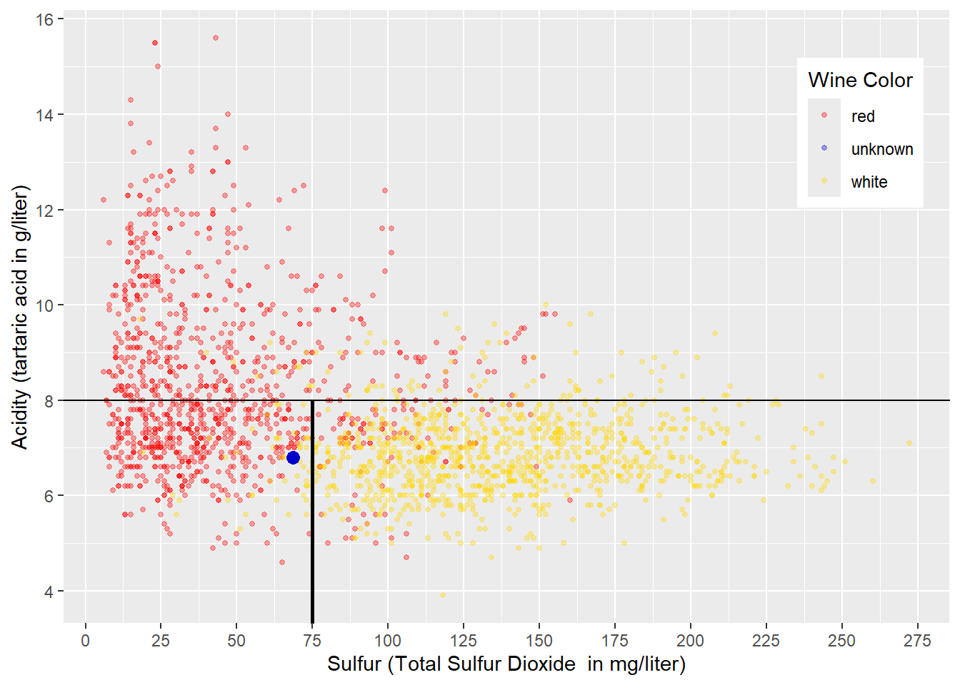
FIGURE 4.3: Sub-Space Boundaries for Acidity and Sulfur in Wine
The decision boundaries in Figure 4.3 create three sub-spaces:
An area for wines with \(Acidity>8\) mainly containing red wines. Therefore, any wine falling into this area would be predicted as red.
An area with wines with \(Acidity<8\) and \(Sulfur<75\) mainly containing red wines. Therefore, any wine falling into this area would be predicted as red. The unknown wine symbolized by the blue point would also be classified as red.
An area with wines with \(Acidity<8\) and \(Sulfur>75\) mainly containing white wines. Therefore, any wine falling into this area would be predicted as white.
The resulting confusion matrix is displayed below:
##           Truth
## Prediction  red white
##      red   1016   145
##      white  103   974
You can see that the accuracy (based on the training data) has improved:
\[ Accuracy=\frac{1016+974} {1016+ 145+ 103+ 974}= 0.89 \]
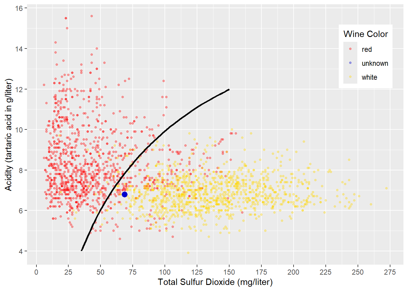
FIGURE 4.4: Curved Decision Boundary for Acidity and Sulfur in Wine
Another approach to classifying the wines in red and white could be to draw a non-linear decision boundary like in Figure 4.4. Wines in the upper-left of the curved decision boundary would be classified as red, and all others would be classified as white. The resulting confusion matrix would be similar to the one shown in the example with sub-spaces. The blue point in Figure 4.4 would be classified as white wine (again, we do not know if this is correct).
The visualizations in Figures 4.3 and 4.4 were chosen for a reason. Creating sub-spaces like in Figure 4.3, is the underlying idea behind Decision Tree and Random Forest machine learning models (see Chapter 10 for details). Generating a non-linear decision boundary like in Figure 4.4 is the underlying idea behind Neural Network models (see Chapter 9 for details).
The idea behind k-Nearest Neighbors will be visualized and explained in what follows.
4.5 The Idea Behind k-Nearest Neighbors
The following two sections will explain the idea behind k-Nearest Neighbors. In Section 4.5.1, we start with the most basic k-Nearest Neighbors model (\(k=1\)). It predicts the class (wine color) for a new observation (wine with unknown \(WineColor\)) by finding the observation closest to it — the nearest neighbor. Then the class (\(WineColor\)) of the nearest neighbor observation is used to predict the unknown observation’s class (\(\widehat{WineColor}\)).
If k-Nearest Neighbors considers more than one neighboring point (\(k>1\)), e.g., the four nearest neighbors (\(k=4\)), the class of the majority of these neighbor points is the predicted class. In case of a tie, the prediction is chosen randomly (see Section 4.5.2 for a visualization of a k=4 Nearest Neighbors model).
In a k-Nearest Neighbors model, the hyper-parameter \(k\) determines the number of neighbors to be considered. \(k\) is called a hyper-parameter because, in contrast to parameters that are determined based on data, it has to be chosen at the design stage of the model.
4.5.1 k-Nearest Neighbors for k=1
We start with \(k=1\), which means that k-Nearest Neighbors focuses only on the closest neighbor.
To introduce the idea, it is best to zoom in from Figure 4.1 closer to the wine we would like to predict (the blue point). This makes it easier to identify the neighbor closest to the blue point.
Figure 4.5 shows the result after zooming in. Eyeballing makes it easy to identify the nearest neighbor to the blue point. The nearest neighbor is the wine (the point) connected with the bold magenta line to the wine we want to predict (the blue point). Since the closest neighbor’s wine color is red, k-Nearest Neighbors with \(k=1\) predicts red for the wine with the unknown wine color.
Eyeballing is a good tool when working with diagrams. Still, for a machine learning model like k-Nearest Neighbors, we have to find a way to measure the distances between the point (the wine) we like to predict and all points in the training dataset. This is the only way to find the nearest neighbor programmatically.

FIGURE 4.5: Predicting Wine Color with k-Nearest Neighbors (k=1)
In Figure 4.5, the two black lines and the magenta line form a right-angled triangle, which means Pythagoras is here to help. If we name the blue point with an index \(p\) (for predict) and the red point we want to calculate the distance to with an index \(i\), then the length of the triangle’s leg \(a\) equals \(Sulfur_i-Sulfur_p\), and the length of leg \(b\) equals \(Acid_i-Acid_p\). The length of the magenta line labeled \(c\) is the distance between the red and the blue point (called Euclidean Distance). To calculate this distance, we can use the Pythagorean theorem:
\[c^2=a^2 +b^2\]
When we substitute \(a\) and \(b\) with the \(Sulfur\) and \(Acid\) differences between the wine we want to predict (blue point) and the wine symbolized by the red dot in the triangle in Figure 4.5, we can calculate the Euclidean Distance (\(EucDist\)) as follows:
\[\begin{eqnarray} \underbrace{EucDist_i^2}_{c^2}&=& \underbrace{(Sulfur_i-Sulfur_p)^2}_{a^2} +\underbrace{(Acid_i-Acid_p)^2}_{b^2} \nonumber \\ &\Longleftrightarrow& \nonumber \\ EucDist_i&=& \sqrt{(Sulfur_i-Sulfur_p)^2 +(Acid_i-Acid_p)^2} \tag{4.1} \end{eqnarray}\]The formula above can be used to calculate the Euclidean Distance between the wine we want to predict (\(p\)) and any other wine (\(i\)) in the training dataset. This is because we know the values of the predictor variables for the point we like to predict as well as the predictor values for all observations in the training dataset. Calculating Euclidean Distances from wine \(p\) to all wines in the training data allows us to find the wine with the smallest distance to wine \(p\). This wine’s color will then become the predicted color for wine \(p\).
Calculate Euclidean Distance for Three or More Variables
Assume our observations have two different predictor variables \(x\) and \(y\), like in the example above. We can then apply the logic from Equation (4.1) and calculate the (Euclidean) distance between a point we like to predict and any point \(i\) as follows: \[EucDist2_i=\sqrt{(x_i-x_p)^2+(y_i-y_p)^2}\] \(EucDist2_i\) is the distance between the two observations in two-dimensional space.
How does the formula change when considering a third predictor variable \(z\)? We just add the new variable under the square root in a similar way as we did it for the other variables: \[EucDist3_i=\sqrt{(x_i-x_p)^2+(y_i-y_p)^2+(z_i-z_p)^2}\]
Interestingly, when considering three variables, \(EucDist3_i\) represents the length of the shortest straight-line between two points in three-dimensional space.
If we consider more variables, a straightforward geometric interpretation is not possible anymore. However, we just add the squared difference of a new variable between the prediction point and a point \(i\) under the square root. For example, in Section 4.10, we will consider 784 variables resulting in a pretty long formula under the square root, but this is no problem for a computer.25
The formula below shows how the Euclidean Distance is calculated between the prediction point \(p\) and a point \(i\) when \(N\) predictor variables \((v_1, v_2, \dots, v_j, \dots, v_N)\) are considered: \[EucDistN_i=\sqrt{\sum_{j=1}^N(v_{i,j}-v_{p,j})^2}\]
Now that you know how to calculate the Euclidean Distance between any two observations for any number of predictor variables, we can demonstrate how the k-Nearest Neighbors model predicts and how its performance can be measured using the testing dataset:
- Step 1:
-
Take the first observation from the testing dataset and calculate the distance from this record to all observations in the training dataset.
- Step 2:
-
Find the observation that has the smallest distance to the testing observation.
- Step 3:
-
The predicted class (e.g., red or white) for the observation from the testing dataset is the same as the class from its nearest neighbor.
- Step 4:
-
For the observation from the testing dataset, we actually know the true class — although we never showed it to the model. Therefore, we can compare the true class of the testing observation with the prediction to find out if the prediction was true or false.
- Step 5:
-
Depending on the prediction (red or white) and whether it was correct, we update one of the four cells in the confusion matrix.
We repeat Steps 1 – 5 for all observations from the testing dataset.
Note, in production — when values for the outcome class (e.g., \(WineColor\)) are unknown, Steps 4 and 5 are omitted.
4.5.2 k-Nearest Neighbors for k>1
So far, we have considered only \(k=1\), but this can be problematic in some cases. Please take a look at Figure 4.6: We used a different wine to predict (blue point) that has a slightly higher acid content (\(Acid=7.3\) instead of \(Acid=6.8\)). Therefore, compared to Figure 4.5 the blue point is now located higher and is nearest to a point (observation) representing a white wine (see \(N_1\) in Figure 4.6). Consequently, the prediction of k-Nearest Neighbors (k=1) would be white. However, in Figure 4.6, red wine observations surround the wine that we try to predict, and the closest white wine seems to be an exception. Intuitively, we would predict the unknown wine as being red.
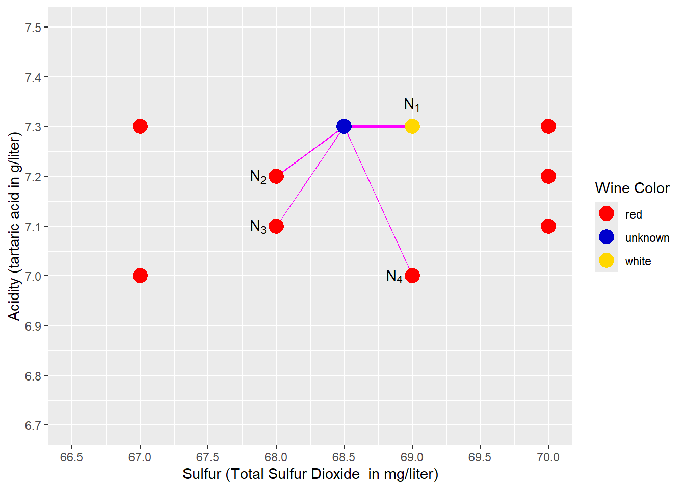
FIGURE 4.6: Predicting Wine Color with k-Nearest Neighbors \((k=4)\)
A k-Nearest Neighbors analysis that considers only one neighbor (the nearest; see \(N_1\) and the bold magenta line in Figure 4.6) might suffer from this type of exception. Therefore, we might consider more than one neighbor \((k>1)\).
Figure 4.6 shows an example for a \(k=4\) Nearest Neighbors model. The four nearest neighbors to the blue prediction point (\(N_1\), \(N_2\), \(N_3\), \(N_4\)) and their distance to the prediction point are marked with four magenta lines. The majority of these 4-nearest neighbors are red wines (3 compared to 1). Consequently, the prediction is red, which is compatible with our intuition. We can also say that the probability of the unknown wine being red is 75% (\(\frac{3}{4}=0.75\)), and the probability of being white is 25% (\(1-0.75=0.25\)).
If one of the three red wines were white, we would end up with a tie. In this case, the predicted wine color would be determined randomly.
In a real-world application, you have to choose the value for the hyper-parameter \(k\) in the model design stage. The chosen \(k\) is then valid for all model predictions. This raises the question: How do we find an appropriate value for \(k\)? The answer is: We use a systematic trial-and-error process called “tuning”.
Tuning the hyper-parameter \(k\) for a Nearest Neighbors model is covered in detail in Chapter 6, Section 6.7.
Right now, you might be tempted to run the model for different values of \(k\) and then use the testing dataset to see which \(k\) delivers the best prediction performance. However, this is not an appropriate way to optimize hyper-parameters. Using the testing dataset to optimize hyper-parameters can lead to overfitting.
Overfitting occurs when a prediction model performs well on the training data, but when it is used for preditions based on new data that the model has “never seen before”, it performs poorly. Therefore, we have to find ways to limit ourselves to the training data when optimizing hyper-parameters such as the \(k\) in k-Nearest Neighbors (see Section 6.7 for methods, for how we can do this).
In general, a \(k\) that is too low is prone to be influenced by isolated outliers, although the surrounding neighborhood would suggest otherwise. On the other hand, a \(k\) that is too high would consider a neighborhood so large that it does not represent the neighborhood surrounding the prediction point anymore.
4.6 Scaling Predictor Variables
Before we build a k-Nearest Neighbors model in R, we have to solve one more problem that can be best illustrated when visualizing the wine data for \(k=1\) again in Figure 4.7.

FIGURE 4.7: Predicting Wine Color with k-Nearest Neighbors \((k=1)\)
Figure 4.7 shows the blue prediction point and its nearest neighbor. The idea behind k-Nearest Neighbors (\(k=1\)) is to find the most similar point (observation) to the prediction point.
First, look at the similarities and dissimilarities between the blue prediction point and its nearest neighbor. At a first glance, it seems in Figure 4.7, the two wines (points) are more dissimilar in terms of \(Acidity\) than in terms of \(Sulfur\) — the length of the vertical leg of the triangle is double the length of the horizontal leg. However, this impression is misleading as it only relates to the scale chosen for the diagram.
In contrast, if we plug in the values for \(Acidity\) and \(Sulfur\) into the Euclidean Distance equation,
\[\begin{eqnarray} \underbrace{EucDist_i^2}_{c^2}&=& \underbrace{(Sulfur_i-Sulfur_p)^2}_{68.5-69} +\underbrace{(Acid_i-Acid_p)^2}_{6.8-7} \nonumber \\ &\Longleftrightarrow& \nonumber \\ EucDist_i&=& \sqrt{0.25 +0.04} \nonumber \end{eqnarray}\]we can see that the influence of the variable \(Sulfur\) on the Euclidean Distance is six times greater than the one of \(Acidity\). Why is this? The variable \(Sulfur\) is measured as sulfur dioxide concentration in the wine in \(mg/liter\), while the variable \(Acidity\) is measured as tartaric acid concentration in the wine in \(g/liter\) (with 1 \(g\) equal to 1,000 \(mg\)). These different scales artificially increase the values of sulfur by a factor of 1,000, contributing to the greater importance of the variable \(Sulfur\) when calculating Euclidean Distance.
To get a less biased representation of both variables when calculating Euclidean Distance, we need to scale the two predictor variables to the same or at least a similar range. This would give both variables the appropriate importance in the Euclidean Distance formula.
There are several scaling techniques available to accomplish this task. Asaithambi (2017) is a good source for comparing common scaling techniques. He explains in detail why scaling might be needed, for which type of machine learning model scaling should be used, and how the most common scaling techniques work.
Here, we will only introduce two commonly used scaling techniques (see keyword Feature Scaling in Wikipedia contributors (2023c) for more details):
Rescaling:
This technique generates a variable \(y_i\) that is scaled to a range between 0 and 1. The calculation is based on the original variable’s value \(x_i\), its minimum \(x_{min}\), and its maximum \(x_{max}\):
\[ y_i=\frac{x_i-x_{min}}{x_{max} - x_{min}}\] You can see how this works when you take a closer look at the extreme values for \(x\): If \(x_i\) is equal to the smallest value in the dataset (\(x_i=x_{min}\)), the numerator and thus the scaled value \(y_i\) becomes \(0\). If \(x_i\) is equal to the largest value in the dataset (\(x_i=x_{max}\)), the numerator becomes \(x_{max}-x_{min}\), and the scaled value becomes \(1\). Therefore, all scaled values are between \(0\) and \(1\). If we scale several predictor variables this way, they will end up in the same range (0 – 1) for all predictor variables.
Z-Score Normalization:
Z-score uses a variable’s mean and the standard deviation for scaling. First, we calculate the mean \(\overline x\) for the original variable \(x\), and then the standard deviation \(s\). To scale the variable \(x\) to the variable \(z\), we use the following formula:
\[z_i=\frac{x_i-\overline x}{s}\]
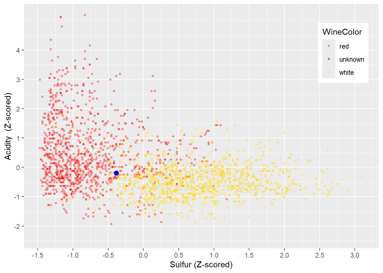
FIGURE 4.8: Z-Normalized Variables Acidity and Sulfur
The resulting Z-score expresses by how many standard deviations a data point deviates negatively or positively from the mean. In theory, Z-scores can be between \(- \infty\) and \(+ \infty\). In reality, in almost all cases, Z-scores range from the mid-negative single digits to the mid-positive single digits. For example, the probability for a normal-distributed variable to have a Z-score greater than 5 or smaller than \(-5\) is 0.000057%.
Therefore, Z-score normalization scales different variables to a similar range, preserves the spread, and does not rely heavily on the largest and smallest values. These properties make Z-score normalization a good candidate for scaling variables before they are used with k-Nearest Neighbors. In Figure 4.8 you can see the Z-score-scaled wine training dataset. The scale for \(Acidity\) and \(Sulfur\) is similar, and the shape of the data is preserved (compare with Figure 4.4).
4.7 Using Tidymodels for k-Nearest Neighbors
This section will use R and a k-Nearest Neighbors model to classify wines into red and white wines based on only two chemical properties (\(Acidity\) and \(Sulfur\)). In Section 4.9, you will work with an interactive project and extend the analysis using more chemical properties.
4.7.1 The tidymodels Package
In the following chapters of this book, we will utilize the R tidymodels package for our analysis. Therefore, before we develop our first machine learning model, we will provide a brief overview about the tidymodels package.
The tidymodels package allows working with a unified syntax and workflow for a wide variety of machine learning models and data engineering tasks. This avoids learning new commands and workflows each time you use a new machine learning model or R package.
The tidymodels package provides a standardized workflow with standardized commands for the following tasks:
Randomly dividing observations into training and testing datasets.
Pre-processing data with recipes where each recipe contains one or more
step_-commands to successively pre-process the training and testing data in exactly the same way. Thesestep_-commands are available for various tasks. For example,step_naomit()can be used to remove incomplete observations or to perform Z-score-normalization,step_normalize()can be used. You can find a list of data pre-processing steps at:
https://www.tidymodels.org/find/recipes/Creating machine learning model-designs with only three standardized commands. At the time of the writing of this book,
tidymodelssupported more than 40 different machine learning models. Rather than building and coding these models separately, thetidymodelspackage provides wrappers around existing machine learning packages and their models. The wrapper translates the standardizedtidymodelscommands internally to a code required by the related package (machine learning model) and then executes the machine learning model. You can find a list of available machine learning models at: https://www.tidymodels.org/find/parsnip/#models)Tuning Hyper-parameters to choose hyper-parameters that need to be determined before the model is calibrated with the training data.
Assessing prediction quality of trained machine learning models with a set of predefined metrics.
The following sections will cover all of these tasks except for hyper-parameter tuning, which will be covered in detail in Chapter 6.
Kuhn and Silge, two of the developers of tidymodels, provide a comprehensive guide to tidymodels, its functionality, and its philosophy (see Kuhn and Silge (2022)).
4.7.2 Loading and Splitting the Data
In the code block further below, we start with loading the needed R packages rio, janitor, and tidymodels.
Note that tidymodels is a meta-package comprising various other packages, including most packages from the tidyverse. Therefore, it is usually not necessary to load the tidyverse package separately.
After loading the packages, we use the same wine dataset as in Section 4.5 and again select only the predictors \(TotalSulfurDioxide\) (renamed to \(Sulfur\)) and \(Acidity\) to predict the outcome variable \(WineColor\) (see import() and select()).
Many machine learning models that perform classification (including k-Nearest Neighbors) require the outcome variable to be an R factor variable (see Section \(\ref{RAndRStudio-RDataTypes}\) for details about R factor variables). In the wine dataset, \(WineColor\) is a character variable. Therefore, we have to use mutate() to transform \(WineColor\) to a factor variable using the as.factor() command:
library(rio); library(janitor); library(tidymodels)
DataWine=import("https://ai.lange-analytics.com/data/WineData.rds") |>
         clean_names("upper_camel") |>
         select(WineColor, Sulfur=TotalSulfurDioxide, Acidity) |>
         mutate(WineColor=as.factor(WineColor))
head(DataWine)
## WineColor Sulfur Acidity
## 1 red 37 10.8
## 2 white 213 6.4
## 3 white 139 9.4
## 4 white 90 8.2
## 5 white 183 6.4
## 6 red 38 6.7After importing the wine data and selecting the variables for analysis, we need to split the dataset into training and testing data. In the code below, we start with initializing the random number generator with set.seed(876) to make the randomization process reproducible. Then we use the initial_split() command to define how the split should be performed. By setting prop=0.7, R will randomly assign 70% of the observations to the training data and the rest to the testing data. The argument strata=WineColor uses \(WineColor\) as the stratifying variable to ensure that red and white wines are approximately equally represented in the training and testing data.
Finally, we extract the training and testing data from the R object Split7030 and assign them to DataTrain and DataTest, respectively:
set.seed(876)
Split7030=initial_split(DataWine, prop=0.7, strata=WineColor)
DataTrain=training(Split7030)
DataTest=testing(Split7030)

head(DataTrain)
## WineColor Sulfur Acidity
## 1 red 37 10.8
## 2 red 38 6.7
## 3 red 12 7.5
## 4 red 25 7.1
## 5 red 114 8.0
## 6 red 66 7.6The first six records of DataTrain are printed above for reference. If you like to review the details about splitting a dataset into training and testing data, go to Section 4.3.
Remember that we need to initialize R’s random number generator to ensure that the randomly generated training and testing datasets are the same each time we run the code (see Section 4.3 for more details).
4.7.3 Recipe for Data Pre-Processing
In this section and throughout the book, we will use recipes from the tidymodels package to pre-process our data. This will simplify data pre-processing and, in addition, clearly show the pre-processing structure.
You can compare a tidymodels recipe to a recipe in a cookbook. First, the ingredients are listed, and then you find the steps to use these ingredients to cook the meal.
RecipeWine=recipe(WineColor~Acidity+Sulfur, data=DataTrain) |>
           step_normalize(all_predictors()) |>
           step_naomit()
Analogous, a tidymodels recipe starts with the command recipe() that selects all variables (ingredients) used in the analysis. The outcome variable is separated from the predictor variables with a tilde symbol (~). In order to separate the predictor variables from each other, a plus sign (+) is used. It is essential to understand that the + sign is unrelated to any type of addition. It is just used as a symbol to separate the predictor variables.
The second required argument in the recipe command is a data= argument that determines which data frame is used for the pre-processing. This data frame is usually the training data frame.
The recipe() command is followed by instructions on how to process the data step by step. Each step starts with step_, indicating that the instruction (command) is part of a recipe.
The recipe() command and all steps used in a recipe are connected with the piping operator (|>) to form the recipe. A recipe is usually saved into an R object. See, for example, the code block above where the recipe is saved into the R objectRecipeWine. We started the object name with the word Recipe to indicate that the object contains a recipe.
The recipe() command in the code block above lists the predictor variables \(Sulfur\) and \(Acidity\) explicitly separated by a + sign. There is also a short form for defining variables as outcome and predictor variables that can be used when the processed data frame exclusively contains the outcome and predictor variables. That is, there are no extra unused variables in the data frame.
We use the short form in the code below to replicate the recipe above. As you can see, there is only a minimal change in the first argument of the recipe() command — called the formula. We still list the outcome variable WineColor followed by the ~ symbol. But on the right-side of the ~ symbol, we simply add a dot (.) instead of listing the predictor variables. The . represents all other variables in the data frame (DataTrain) that are not outcome variables — all predictor variables.
Previously, you learned that predictor variables must be scaled before using them in a k-Nearest Neighbors model. Scaling avoids variables with greater values having a stronger influence on the prediction results than variables with lower values. Recall that previously Z-score normalization was introduced as an effective scaling method (see Section 4.6 for details).
The package tidymodels provides a command step_normalize() that performs Z-score normalization and can be added to a recipe. We can add the variables that need to be Z-score normalized as arguments into the step_normalize() command, such as step_normalize(Sulfur, Acidity). This is fine when you only have two predictor variables, but it can become tedious if you have many predictor variables. Therefore, tidymodels allows us to use a broader definition for the variables that need to be pre-processed. In the code block below, we use step_normalize(all_predictors()) to normalize all of our predictor variables.
We also add step_naomit() to the recipe above. This ensures that incomplete observations are deleted. It is good practice to add this step and to monitor which and how many observations are deleted.
When we print the recipe RecipeWine, we can see that two variables were assigned the predictor role, and one was assigned the outcome role. We can also see the steps that we had defined:
## ## ── Recipe ───────────────────────────## ## ── Inputs## Number of variables by role## outcome: 1
## predictor: 2## ## ── Operations## • Removing rows with NA values in:
## <none>## • Centering and scaling for:
## all_predictors()It is important to realize that the recipe above does not process any data at this point; it only holds the instructions on which variables are outcome/predictor variables and how to process them later when executing the recipe. Again, a recipe in R can be compared to a recipe in a cookbook. A cookbook recipe does not make the meal. It only gives instructions on how to make the meal We will use a workflow() later in Section 4.7.5 to automatically prepare the recipe for execution, generate the pre-processed data, and finally use the pre-processed data as input for a machine learning model.26
You might have noticed that the select() and the mutate() commands were used right after the data was loaded with import() — before the recipe RecipeWine was even defined. This raises the question:
When should we use select() and mutate(), and when should we use a recipe to pre-process data?
Here are some suggestions:
Generally, using a recipe is advisable because we can reuse a recipe on other data frames.
It is good practice to use
select()before a recipe to reduce the columns of an original data frame to only those columns (variables) that are required for the analysis. This allows us to use the.-notation in the formula argument of therecipe()command.When transforming outcome variables, it is advised to always do this outside of a recipe. For example, in the R code above, we used
mutate()to convert the outcome variable \(WineColor\) from acharacterdata type to afactordata type outside the recipe. If a recipe is later used on another dataset for prediction, this dataset might not contain a column for the outcome variable.27 More about why recipes should not be used on outcome variables in Kuhn and Silge (2022), Section 8.4.
4.7.4 Creating a Model-Design
A model design determines which machine learning model from which R package should be used for the analysis.
To define a model design within the tidymodels environment, only three commands (connected with |>) are required. The following code block shows how to generate a machine learning model design for a k-Nearest Neighbors model:
ModelDesignKNN=nearest_neighbor(neighbors=4,
weight_func="rectangular") |>
set_engine("kknn") |>
set_mode("classification")As you can see, the k-Nearest Neighbors model is designed with only three commands:
A command determining the name of the machine learning algorithm (in this case
nearest_neighbor()) and optionally hyper-parameter for the model. Here we usedneighbors=4to determine the value for \(k\) (number of neighbors), andweight_function=rectangularto ensure that the original k-Nearest Neighbors algorithm is used.A
set_engine()command to provide the name of the package that performs the machine learning algorithm (in this case,set_engine("kknn")). Note there is no need to load the package vialibrary()because this is done internally by theset_engine()command, but the package must be installed before you use it.A
set_mode()command that indicates if we perform a classification or a regression.
The model design is then stored in an R object (ModelDesignKNN). As the name suggests, ModelDesignKNN is only a design for a model, like a blueprint. A model design like ModelDesignKNN only contains a model description, and no data are fitted to the model at this point of the development. Consequently, ModelDesignKNN in its current state cannot be used for predictions.
When we print the model design, we get some basic information about the model design.
## K-Nearest Neighbor Model Specification (classification)
##
## Main Arguments:
## neighbors = 4
## weight_func = rectangular
##
## Computational engine: kknnTo find detailed information about how k-Nearest Neighbors is implemented through the kknn package, we refer to Hechenbichler and Schliep (2004). To find more details about model design in tidymodels see Kuhn and Silge (2022), Chapter 6.
4.7.5 Creating and Training a Workflow
In the two previous sections, we defined a recipe and a model design. In this section, we will put it all together in a workflow. A workflow combines a recipe for data pre-processing with a model design into a workflow. Afterward, the workflow needs to be fitted (calibrated) to the training data before it can be used to predict (more about fitted vs. unfitted machine learning models will be covered in Section 5.4.2).
In the code block below, we start with the workflow() command, and we add the recipe (add_recipe(RecipeWine)) and the model design (add_model(ModelDesignKNN)) to the workflow. Then we fit the workflow to the training data with fit(DataTrain) and save the fitted workflow model into the R object WFModelWine. We decided to begin the object name with \(\mbox{WFModel}\) to indicate that this R object is a workflow model ready to be used for predictions.
4.7.6 Predicting with a Fitted Workflow Model
In this section, we will use the fitted workflow model from the previous section to predict the \(WineColor\) for the observations of the testing dataset DataTest.
We use the testing rather than the training dataset because we want to assess the model’s prediction quality rather than how well the model can approximate the training data.
To predict the wine color of different wines based on their acidity and sulfur dioxide content, we can use the predict() command. As you can see in the code block below, the predict() command only requires two arguments: the name of the trained workflow object (WFModelWine) and the name of the data frame that contains the predictor variables for the prediction (DataTest):
The predict() command pre-processes the testing data as defined in the recipe and then uses the fitted workflow model (WFModelWine) to predict the \(WineColor\). The predictions can be assigned to a data frame (in this case, DataPred).
You can see the predictions for the first six wines in the testing dataset in the printout below:
## # A tibble: 6 × 1
## .pred_class
## <fct>
## 1 white
## 2 red
## 3 white
## 4 white
## 5 white
## 6 redThe variable with the prediction is automatically named \(.pred\_class\). However, we cannot see if the predictions are correct because we cannot easily compare the estimate (\(.pred\_class\); stored in DataPred) to the truth (\(WineColor\); stored in DataTest).
It would be great if the data frame DataTest could be augmented with the predictions from the workflow. Then we could observe estimate and truth together. This is precisely what the augment() command does.
The augment() command predicts first and then adds the prediction column(s) to the data frame used to predict. It requires the same arguments as the predict() command: First, the name of the fitted workflow object, and second the name of the data frame containing the predictor variables. When executing the augment() command, it performs the predictions and combines the resulting prediction results with the data frame that was used for the prediction (e.g., DataTest). The result is usually saved in a new data frame (e.g., \(DataTestWithPred\)):
## # A tibble: 6 × 6
## .pred_class .pred_red .pred_white WineColor Sulfur
## <fct> <dbl> <dbl> <fct> <dbl>
## 1 white 0.25 0.75 white 90
## 2 red 1 0 red 19
## 3 white 0 1 white 220
## 4 white 0.25 0.75 red 131
## 5 white 0 1 white 161
## 6 red 1 0 red 41
## # ℹ 1 more variable: Acidity <dbl>The printout of the first six observations from the data frame DataTestWithPred shows the truth in the outcome variable \(WineColor\) and the estimate in the variable \(.pred\_class\). Five of the six observations are predicted correctly, while one (the fourth observation) is mispredicted.
The augment() command also calculates the probabilities for each observation to be a red or a white wine and stores them in the variables \(.pred\_red\) and \(.pred\_white\), respectively. These probabilities result from the voting process of the k-Nearest Neighbors. Remember, we considered the four nearest neighbors. Therefore, the vote for the color red could be either 25%, 50%, 75%, or 100%, which is reflected in the probabilities of the variable \(.pred\_red\). The probabilities for white wine follow from \(.pred\_white=1-.pred\_red\)
4.7.7 Assessing the Predictive Quality with Metrics
The tidymodels package provides several commands to calculate metrics that reflect predictive performance. Most of these commands compare the estimate with the truth and then calculate the related metrics.
For example, we can use the con_mat() command from tidymodels to create a confusion matrix. The command requires three arguments:
The name of the data frame that contains the
estimateand thetruth(e.g.,DataTestWithPred).The variable that contains the truth (e.g., \(DataWine\))
The variable that contains the estimate (e.g., \(.pred\_class\))
The code block below uses conf_mat() in combination with the data frame DataTestWithPred to generate a confusion matrix:
ConfMatrixWine=conf_mat(DataTestWithPred, truth=WineColor,
estimate=.pred_class)
print(ConfMatrixWine)## Truth
## Prediction red white
## red 436 46
## white 44 434The sum of the counts of the main-diagonal elements of the confusion matrix (the counts of correctly predicted wines) is very high, compared to the sum of the counts of the off-diagonal elements (the counts of the falsely predicted wines). This is the first indicator for a good prediction quality. However, as the following section will show, we have to analyze the confusion matrix in more depth to gain an accurate, objective assessment about the prediction quality.
4.8 Interpreting a Confusion Matrix
In the previous section, a confusion matrix was created to assess the predictive quality of the k-Nearest Neighbors model. The first classification class (red in our example) listed in a confusion matrix is usually called the Positive Class, while the second class listed is the Negative Class (white in our example). However, which class is considered positive and which one is considered negative is arbitrary and mostly not important as long as we agree on which one is positive and which is negative.28
The confusion matrix from the previous section is printed below. For easier readability, the four entry fields are labeled as True Positives (TP), False Positives (FP), False Negatives (FN), and True Negatives (TN):
## Truth
## Prediction red white
## red TP: 436 FP: 46
## white FN: 44 TN: 434Both entries (cells) in the first row of the confusion matrix represent the counts for predicting a wine as red (the positive class). The first entry shows 436 wines predicted as red which are actually red (True Positives; TP). On the other hand, the second entry of the first row represents 46 red wines that are predicted as red, and are therefore falsely predicted because they are actually white (False Positives; FP).
We can make similar statements for the second row in the confusion matrix. The second row represents the two counts for wines that are predicted as white (the negative class). 44 wines are predicted as white, but because they are actually red, they are falsely predicted (False Negatives; FN), while 434 are correctly predicted as white (True Negatives; TN).29
We can calculate testing data accuracy and see that the result has improved compared to our visual attempts in Section 4.4:
\[Accuracy=\frac{TP+TN}{TP+FP+TN+FN}=\frac {436+ 434} {960}= 0.91\]
Warning: Be careful when interpreting accuracy as a single metric!
Confusion Matrix: Be Careful with Accuracy
The following made-up story demonstrates a problem when only accuracy is used to evaluate a machine learning model:
Dr. Nebulous offers what he calls a 97% Machine Learning Gambling Prediction. Here is how it works: Gamblers can buy a prediction from Dr. Nebulous for a fee of $5. Dr. Nebulous will then run his famous machine learning model and send a closed envelope with the prediction. The gambler is supposed to open the envelope in the casino right before placing a bet of $100 on a number in roulette. The envelope contains a message that states either “You will win” or “You will lose”, which allows the gambler to act accordingly by either placing or not placing the bet.
Dr. Nebulous claims that a “clinical trial” performed by 1,000 volunteers, who opened the envelope after they had bet on a number in roulette, shows an accuracy of 97.3%.
How could Dr. Nebulous have such a precise model? The trick is that his machine learning model uses what is called a naive prognosis: It always predicts “You will lose”.
Let us take a look at the confusion matrix from the 1,000 volunteers’ trial:
## Truth
## Prediction Win Lose
## Win 0 0
## Lose 27 973Roulette has (including the zero) 37 numbers to bet on. Consequently, the chance to win is \(\frac{1}{37}=0.027\). This means that out of the 1000 volunteers, 27 are expected to win, and 973 are expected to lose. You can see that in the confusion matrix above, the accuracy promised by Dr. Nebulous is correct: When you divide the sum of the diagonal elements of the matrix by the observations, you get 0.973 (\(\frac{0+973}{1000}\)).
However, when we look at the correct positive and negative rates separately, we see that Dr. Nebulous’s accuracy rate (although correct) makes little sense.
The correct negative rate (specificity) is 100% (out of 973 volunteers who lost, all were correctly predicted as “You will lose”). But, the correct positive rate (sensitivity) is 0% (out of the 27 winners, all were falsely predicted as “You will lose”). This example shows:
When interpreting the confusion matrix, you must look at accuracy, sensitivity, and specificity simultaneously.
In the example above, Dr. Nebulous intentionally misused the confusion matrix’s interpretation to his financial advantage.
However, you can unintentionally run into the same problem because sometimes machine learning models “choose the easiest way” to generate a successful prediction, which can be the naive prognosis.
This is especially true when the outcome variable in the classification model is unbalanced, meaning that values for one of the classes (negative or positive) occur dramatically more often than others. You will learn how to identify unbalanced datasets and how to mitigate the problem in Chapter 8.
To make sure the high accuracy rate from our k-Nearest Neighbors model is not misleading, we will separately calculate sensitivity — the rate of correctly predicted positives (red wines) and specificity — the rate of correctly predicted negatives (white wines).
We start with calculating sensitivity from the confusion matrix: 480 wines (the sum of the left column) in the testing dataset are red wines (positive class). From these red wines, 436 were predicted correctly. Therefore we can calculate sensitivity as follows:
\[Sensitivity=\frac{TP}{TP+FN}= \frac{436} {436+44}= 0.9083\]
Specificity is calculated similarly, but we focus on the right column of the confusion matrix: 480 wines (the sum of the entries in the right column) in the testing dataset are white wines (negative class). From these white wines, 434 were predicted correctly. Therefore we can calculate specificity as follows:
\[Specificity=\frac{TN}{FP+TN}= \frac{434} {46+434}= 0.9042\]
To summarize, based on the testing dataset, the overall accuracy (proportion of overall correctly predicted wines) was 90.62%, sensitivity (proportion of correctly predicted red wines) was 90.83%, and specificity the (proportion of correctly predicted white wines) was 90.42%. These are pretty good results.30
For the analysis in this section, we used only two predictor variables (sulfur dioxide content and acidity of the wines). In the following section, you will repeat the analysis with your own model, but you will use all available predictor variables to improve the predictive quality further.
4.9 🧭Project: Predicting Wine Color with Several Chemical Properties
Interactive Section
In this section, you will find content together with R code to execute, change, and rerun in RStudio.
The best way to read and to work with this section is to open it with RStudio. Then you can interactively work on R code exercises and R projects within a web browser. This way you can apply what you have learned so far and extend your knowledge. You can also choose to continue reading either in the book or online, but you will not benefit from the interactive learning experience.
To work with this section in RStudio in an interactive environment, follow these steps:
Ensure that both the
learnRand theshinypackage are installed. If not, install them from RStudio’s main menu (Tools -> Install Packages \(\dots\)).Download the
Rmdfile for the interactive session and save it in yourprojectfolder. You will find the link for the download below.Open the downloaded file in RStudio and click the
Run Documentbutton, located in the editing window’s top-middle area.
For detailed help for running the exercises including videos for Windows and Mac users we refer to: https://blog.lange-analytics.com/2024/01/interactsessions.html
Do not skip this interactive section because besides providing applications of already covered concepts, it will also extend what you have learned so far.
Below is the link to download the interactive section:
https://ai.lange-analytics.com/exc/?file=04-KNearNeighExerc200.Rmd
In what follows, you will develop your own k-Nearest Neighbors model to predict the color of wines based on chemical properties. In contrast to the previous section, you will extend the analysis to use all chemical properties available in the wine dataset.
Below you can see all variables available in the wine dataset. The first variable \(WineColor\) is the outcome variable, followed by the predictor variables that indicate the chemical properties of a wine. The last variable \(Quality\) reflects how consumers rated the quality of the wines. This variable is not a chemical property and is likely irrelevant for predicting a wine’s color. Therefore, \(Quality\) should not be used as a predictor.
## [1] "WineColor" "Acidity"
## [3] "VolatileAcidity" "CitricAcid"
## [5] "ResidualSugar" "Chlorides"
## [7] "FreeSulfurDioxide" "TotalSulfurDioxide"
## [9] "Density" "PH"
## [11] "Sulphates" "Alcohol"
## [13] "Quality"The code block below loads the wine dataset, changes variable names to UpperCamel notation, unselects the variable \(Quality\) from the data, renames \(TotalSulfurDioxide\) to \(Sulfur\), and defines \(WineColor\) as factor data type.
After the random number generator has been initialized, the data are split into training and testing data (see Section 4.3 for details).
Now it is your turn: Please complete the two commands that extract training and testing data from the split to assign them to the data frames DataTrain and DataTest.
library(tidymodels); library(rio); library(janitor)
DataWine=import("https://ai.lange-analytics.com/data/WineData.rds") |>
clean_names("upper_camel") |>
select(-Quality) |>
rename(Sulfur=TotalSulfurDioxide) |>
mutate(WineColor=as.factor(WineColor))
set.seed(876)
Split7030=initial_split(DataWine, prop=0.7, strata=WineColor)
DataTrain=...(...)
DataTest=...(...)
head(DataTrain)Next, by executing the code block below, you will create the recipe. The command is the same as before, and the results will be saved into the R object RecipeWine:
RecipeWine=recipe(WineColor~., data=DataTrain) |>
           step_naomit() |>
           step_normalize(all_predictors())
print(RecipeWine)## ## ── Recipe ───────────────────────────## ## ── Inputs## Number of variables by role## outcome: 1
## predictor: 11## ## ── Operations## • Removing rows with NA values in:
## <none>## • Centering and scaling for:
## all_predictors()The commands to create the model design are also the same as before. When you execute the code block below, the model design will be created and saved into the R object ModelDesignKNN:
ModelDesignKNN=nearest_neighbor(neighbors=4,
                                weight_func="rectangular") |>
               set_engine("kknn") |>
               set_mode("classification")
print(ModelDesignKNN)## K-Nearest Neighbor Model Specification (classification)
##
## Main Arguments:
## neighbors = 4
## weight_func = rectangular
##
## Computational engine: kknnYou are now tasked with adding the recipe and the model design to a workflow and then fitting the workflow to the training data. Note that the recipe RecipeWine, the model design ModelDesignKNN, and the data frame DataTrain have already been loaded in the background. Please complete the code block below and execute it.
Because the workflow model is fitted to the training data, we can use it for predictions. Instead of using the predict() command, we again use the more comprehensive augment() command, which predicts \(WineColor\) based on the predictor variables from the testing dataset and then adds the predictions as a new variable named \(.pred\_class\) to DataTest. The complete result is saved in the R object DataTestWithPred.
Since the R object DataTestWithPred contains the predictions (estimate) for the wine color and also the truth, stored in variable \(WineColor\), we can use it as the data argument for metrics commands. An example is the conf_mat() command that generates a confusion matrix. The related code is already prepared. You just have to execute it.
DataTestWithPred=augment(WFModelWine, DataTest)
conf_mat(DataTestWithPred, truth=WineColor, estimate=.pred_class)
## Truth
## Prediction red white
## red 474 2
## white 6 478A first glance at the diagonal elements of the confusion matrix already indicates an improvement over the model with two predictor variables.
The tidymodels package can help you to calculate metrics such as accuracy, sensitivity, and specificity. Instead of calculating these metrics separately you can streamline the process by creating a metric set first.
In the code block below, the command metric_set() creates a new command to calculate accurracy, sensitivity, and specificity. We name the new command MetricsWine.
The newly created command MetricWine() can be used similarly to the conf_mat() command, but instead of creating a confusion matrix, it creates all the metrics previously specified with metric_set() simultaneously. This saves you some typing effort.
Give it a try with the code block below (note, the data frame DataTest and the fitted workflow model WFModelWine have already been loaded in the background):
DataTestWithPred=augment(WFModelWine, DataTest)

MetricsWine=metric_set(accuracy, sensitivity, specificity)
MetricsWine(DataTestWithPred, truth=WineColor, estimate=.pred_class)
## # A tibble: 3 × 3
## .metric .estimator .estimate
## <chr> <chr> <dbl>
## 1 accuracy binary 0.992
## 2 sensitivity binary 0.988
## 3 specificity binary 0.996As the confusion matrix and the three metrics above confirm, we reached an almost perfect prediction quality.
Try changing the arguments in the metric_set() command to different metrics and see what happens.
Predicting the wine color from the wine dataset is a notoriously easy task. Therefore, the next section will approach a more realistic problem. We will try to identify the ten digits (0 – 9) from handwriting. This is also known as OCR (Optical Character Recognition).
4.10 🧭Project: Recognize Handwriten Numbers
In this section, you will develop a machine learning model based on k-Nearest Neighbors for a real-world application. The goal is to recognize handwritten digits from images. You will use the MNIST dataset, a standard dataset for image recognition. The MNIST dataset is publicly available and contains 60,000 images for training and 10,000 images for testing purposes. LeCun, Cortes, and Burges (2005) developed the MNIST dataset based on two datasets from handwritten digits obtained from census workers and high school students.
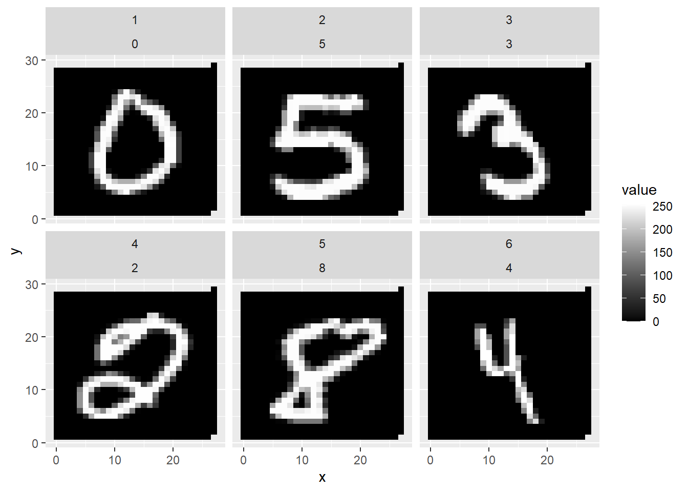
FIGURE 4.9: First Six Handwritten Numbers of the MNIST Dataset
Figure 4.9 shows a printout of the first six images from the MNIST dataset, giving you an idea of how the census workers and high school students wrote the numbers.
Rather than using the complete MNIST dataset, in this project, we will use only a subset (the first 500 images/rows of the original MNIST dataset) to speed up the training time. In the digital resources section (see Section 4.12) of this chapter, you will find links for sample images of 500, 1,000, and 10,000, as well as the link to the original dataset. This allows you to modify the code below to use more observations.
The machine learning model in this section recognizes only handwritten digits. Other more advanced but similar applications recognize numbers and characters from scanned documents. OCR in the Adobe PDF app is one of these examples.
4.10.1 How Images Are Stored
Before working with a k-Nearest Neighbors model, we first need to understand the problem we are trying to solve. This is when domain knowledge plays an important role. Domain knowledge is the knowledge about a specific field or discipline outside of machine learning. In the case of image recognition, domain knowledge involves understanding how images can be stored in a dataset.
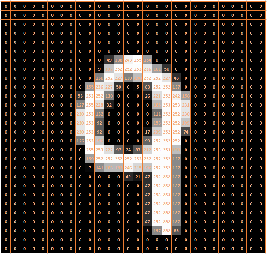
FIGURE 4.10: Raster Image of a Nine
In general, a gray-scale image can be stored in a raster format. A raster is a grid with two dimensions. The MNIST images are stored in a grid of 28 rows and 28 columns. Each entry in this grid (called a pixel) indicates the brightness of the cell on a scale from 0 to 255. A value of 0 indicates black, a value of 255 indicates white, and values between 0 and 255 indicate some degree of gray.
Figure 4.10 shows an example of how a handwritten “9” can be stored in an image file. The background colors in the cells of Figure 4.10 are only for demonstration purposes. An image file would only contain numbers between 0 and 255 organized in rows and columns separated by commas.
There is a problem when working with images in a machine learning model. Machine learning models usually require that each observation is within a row of a data frame and that the columns represent predictor variables. As explained above, images are stored in a 2D grid.
| Label | PIX1 | PIX2 | PIX3 | … | PIX783 | PIX784 |
|---|---|---|---|---|---|---|
| 0 | 0 | 0 | 0 | … | 0 | 0 |
| 5 | 0 | 0 | 0 | … | 0 | 0 |
| 3 | 0 | 0 | 0 | … | 0 | 0 |
| 2 | 0 | 0 | 0 | … | 0 | 0 |
| 8 | 0 | 0 | 0 | … | 0 | 0 |
| 4 | 0 | 0 | 0 | … | 0 | 0 |
The solution is to combine all the rows of an image into one long row of pixels. In our case, we start with the first row, append the second row of the image raster, append the third row, and so on, until we finally append the 28th row. Because the images initially have 28 rows and 28 columns, each image would then be converted to one long row consisting of 784 (\(28\cdot 28\)) columns. This was done with the MNIST dataset. Each image is stored in one row. Each of the 784 pixels of an image is stored in one of 784 columns. These columns will become the 784 predictor variables. The outcome variable (called \(Label\)) is stored in the first column of the data frame. It contains each image’s digit.
Take a look at Table 4.1, which shows an excerpt from the MNIST data frame for the first six images. Note that the table does not show all 784 predictor variables (pixels). Instead, it only shows the pixel values for the first three pixels and the last two pixels for the six images. These pixels represent the left-upper and the right-lower corner for each of the six images. They are all 0 (black) because the digits were written with a white pen, and the corresponding pixels are more in the center of the image.
4.10.2 Build Recipe, Model-Design, and Workflow
Interactive Section
In this section, you will find content together with R code to execute, change, and rerun in RStudio.
The best way to read and to work with this section is to open it with RStudio. Then you can interactively work on R code exercises and R projects within a web browser. This way you can apply what you have learned so far and extend your knowledge. You can also choose to continue reading either in the book or online, but you will not benefit from the interactive learning experience.
To work with this section in RStudio in an interactive environment, follow these steps:
Ensure that both the
learnRand theshinypackage are installed. If not, install them from RStudio’s main menu (Tools -> Install Packages \(\dots\)).Download the
Rmdfile for the interactive session and save it in yourprojectfolder. You will find the link for the download below.Open the downloaded file in RStudio and click the
Run Documentbutton, located in the editing window’s top-middle area.
For detailed help for running the exercises including videos for Windows and Mac users we refer to: https://blog.lange-analytics.com/2024/01/interactsessions.html
Do not skip this interactive section because besides providing applications of already covered concepts, it will also extend what you have learned so far.
Below is the link to download the interactive section:
https://ai.lange-analytics.com/exc/?file=04-KNearNeighExerc300.Rmd
Now that you know how the images of the MNIST dataset are stored, you can start the machine learning project by importing the data. The first line in the code block further below imports a data frame with the first 500 images from the original MNIST dataset. Each image is stored in a row with the label indicating which of the ten digits it represents.
Please complete the code block below in the interactive version of this section in RStudio. Here are a few hints:
The \(Label\) for each image is stored as an
integerdata type, but k-Nearest Neighbors only accepts afactordata type for the outcome variable. Therefore, you must transform the outcome variable \(Label\) tofactordata type.When splitting the dataset into training and testing data, you can use
strata=to indicate that the numbers stored in \(Label\) are approximately equally represented in the training and the testing dataset. After you have completed the commands in the code block, thehead(DataTrain)command will show you the first six observations of the training dataset.
DataMnist=import("https://ai.lange-analytics.com/data/MN500.rds") |>
mutate(Label=as.factor(...))
set.seed(123)
Split7030=initial_split(DataMnist, 0.70, strata=...)
DataTrain=training(...)
DataTest=...(...)

head(DataTrain)
When developing a machine learning model with tidymodels, you can always follow the same process:
Define a recipe to pre-process the data and define which variables are outcome and which are predictor variables (for details about recipes see Section 4.7.1).
Define the model design that determines which machine learning model to use and which R package contains the model (for details about model design see Section 4.7.1).
Add the recipe and the model design to a workflow and use the training data to fit the machine learning model. The resulting workflow model can then be used for predictions (for details about workflows see Section 4.7.5).
The code block below completes Steps 1 and 2. The first line creates the recipe, and it is stored in an R object that is named RecipeMnist. We can use Label~. to determine that \(Label\) is the outcome variable, and all other variables are predictor variables because the data frame DataTrain contains exclusively outcome and predictor variables. Normalization with step_normalize() is unnecessary because the predictor variables are already in the same range (from \(0\) for black to 255 for white). Also, all observations are complete. Therefore, step_naomit() is not needed either.
The second step is your task. Please complete the command that defines the model design and store the result in the R object ModelDesignKNN. Use the model nearest_neighbor() from the R package kknn and remember that the model is a classification rather than a regression model.
After completing and executing the code block, R will print a summary of the recipe and the model design.
RecipeMnist=recipe(Label~., data=DataTrain)

ModelDesignKNN=...(neighbors=5, weight_func="rectangular") |>
                 set_engine("...") |>
                 set_mode("...")

print(RecipeMnist)
print(ModelDesignKNN)
Now, you can move to the third step to create a fitted workflow model. In the code block below, you add the recipe (RecipeMnist) and the model design (ModelDesignKNN) to a workflow, and then you fit the workflow with the training data stored in DataTrain. The fitted workflow model is then saved in the object WFModelMnist. When you print the fitted workflow model, R will provide information about the recipe and the fitted model. This might take a moment. So, be a little patient.
Since WFModelMnist is a fitted workflow model, you can use it to predict the images in the testing dataset (DataTest). Again, you will use the command augment() instead of predict(). Consequently, the testing dataset will be augmented with a new column .pred_class that contains predicted digits for each image. The result will then be saved into the data frame DataTestWithPred.
DataTestWithPred=augment(..., ...)

head(DataTestWithPred |> select(Label, .pred_class, everything()))
The head command prints the first six observations. You will see that DataTestWithPred now contains for each observation both the predictions (\(.pred\_class\)) and the true value (in this case, \(Label\)).
Remember, this is crucial for assessing a model’s prediction quality because many tidymodels commands that assess predictive quality require a variable for a truth argument (in this case, truth=Label) and a variable for the estimate argument (in this case estimate=.pred_class). The conf_mat() command, which generates the confusion matrix, is an example (note that the data frame DataTestWithPred has already been loaded in the background):
##           Truth
## Prediction  0  1  2  3  4  5  6  7  8  9
##          0  9  0  1  0  0  0  1  0  0  0
##          1  0 18  3  1  2  2  1  1  0  0
##          2  0  0 10  0  0  0  0  0  0  0
##          3  1  0  1 11  0  0  0  0  0  0
##          4  1  0  0  1 16  0  0  0  0  1
##          5  0  0  0  1  0 12  2  0  0  0
##          6  0  0  0  0  0  0 11  0  0  0
##          7  0  0  1  0  0  0  0  7  0  2
##          8  0  0  0  0  0  0  0  0 11  0
##          9  0  0  0  0  1  1  0  7  2 13
Again, counts for correct predictions are aligned in the cells on the main diagonal. For example, Row 3 contains counts for cases where three was predicted. Column 3 contains counts for observations where the label was actually three. Consequently, the count in Row 3 and Column 3 shows the count of correct predictions (\(11\)).
To calculate other metrics for the testing data, we again use the metric_set() command and require to calculate accuracy, sensitivity, and specificity. The resulting R command is saved in the R object MetricsSetMnist.
Then, in the second line of code, we execute the MetricsSetMnist() command with the same arguments that we used to create the confusion metrics.
MetricsSetMnist=metric_set(accuracy, sensitivity, specificity)
MetricsSetMnist(DataTestWithPred, truth=Label, estimate=.pred_class)
## # A tibble: 3 × 3
## .metric .estimator .estimate
## <chr> <chr> <dbl>
## 1 accuracy multiclass 0.776
## 2 sensitivity macro 0.773
## 3 specificity macro 0.975The calculated metrics confirm the overall good prediction quality. The accuracy of the model is 77.6%. This is a good result compared to a simple guess that would generate an accuracy of about 10%. Sensitivity (True Positive rate) and specificity (True Negative rate) also indicate good predictive quality. Note that these metrics were calculated as averages over all ten digits (indicated by the term macro in the printout).31
You can improve the result by using more observations from the MNIST dataset. In the digital resource section (see Section 4.12) you can download an R script that contains the code used in this section. That R script allows you to use MNIST samples with more observations (1,000 and 10,000) to improve the predictive results.
4.11 When and When Not to Use kNN Models
k-Nearest Neighbors can be used to solve classification problems similar to the ones in this section. k-Nearest Neighbors usually produces good prediction results.
In principle, k-Nearest Neighbors can also be used for regression problems. First, it finds the k nearest neighbor observations. Afterward, the mean of the outcome variable of the k nearest neighbors is used to generate the prediction. However, k-Nearest Neighbors is rarely used for regression models because other machine learning models, such as Ordinary Least Square (OLS) regression , Neural Networks, or Random Forest models, usually perform better.
Besides using k-Nearest Neighbors for prediction purposes, it is also useful to identify similar observations. For example, when somebody is using a dating website, the website often searches its database for similar partners in terms of age, income, education, and interests. If 20 partner recommendations are required, k-Nearest Neighbors (\(k=20\)) finds the 20 most compatible potential partners (similar in terms of Euclidean Distance).
Some video recommendation systems work similarly. The machine learning algorithm would first find customers with a similar viewing history and then recommend videos that these customers had watched and rated high.
A disadvantage of k-Nearest Neighbors models is their slow performance. When the number of predictor variables and/or the number of observations becomes large, k-Nearest Neighbors can be prohibitively slow.
Consider that the original MNIST dataset consists of 60,000 training observations and 10,000 testing observations. This means that k-Nearest Neighbors needs to compare each of the 10,000 testing images with all of the 60,000 training images for each of the 784 pixels. This would lead to 470,400,000,000 (\(10,000 \cdot 60,000 \cdot 784\)) pixel comparisons. While this is still possible with a fast computer, a faster comparison algorithm, and a lot of patience, it becomes very problematic when we consider images with better resolution — e.g., 1280×1024. This would lead to (10,000 \(\cdot\) 60,000 \(\cdot\) 1280 \(\cdot\) 1024) pixel comparisons. You do the math.
4.12 Digital Resourses
Below you will find a few digital resources related to this chapter such as:
- Videos
- Short articles
- Tutorials
- R scripts
These resources are recommended if you would like to review the chapter from a different angle or to go beyond what was covered in the chapter.
Here we show only a few of the digital resourses. At the end of the list you will find a link to additonal digital resources for this chapter that are maintained on the Internet.
You can find a complete list of digital resources for all book chapters on the companion website: https://ai.lange-analytics.com/digitalresources.html
R Script and Data Sources for MNIST Data Analysis
The material provided below allows you to experiment with recognizing handwritten notes from the MNIST dataset using k-Nearest Neighbors.
You can use the import() command from the rio package together with the links below to import random subsets of the MNIST dataset as well as the complete MNIST dataset:
- 500 sample observations (R data frame):
https://ai.lange-analytics.com/data/MN500.rds - 1,000 sample observations (R data frame):
https://ai.lange-analytics.com/data/MN1000.rds - 10,000 sample observations (R data frame):
https://ai.lange-analytics.com/data/MN10000.rds - Complete MNISTdataset as (R list object):
https://ai.lange-analytics.com/data/MN.rds
Example:
library(rio)
DataMnist=import(“https://ai.lange-analytics.com/data/MN500.rds”)
Alternatively, you can download an R script that you can use as a template to work with the various MNIST data subsets. See the link below.

Free DataCamp Course About k-Nearest Neighbors
This is a free course from DataCamp that introduces k-Nearest Neighbors. It is interactive, and it provides exercises. The course covers other classification models as well, but they are not free.

A Video Tutorial for k-Nearest Neighbors to Recognize Handwriting
This R tutorial video by Carsten Lange shows how handwritten digits from images of the MNIST dataset can be classified using k-Nearest Neighbors.

More Digital Resources
Only a subset of digital resources is listed in this section. The link below points to additional, concurrently updated resources for this chapter.

References
An exception are time series data, where the most up-to-date data are assigned to the testing dataset.↩︎
To avoid writing very long formulas, a programmer who creates a k-Nearest Neighbors algorithm would most likely use matrix algebra.↩︎
In case you need to prepare and execute a recipe manually, you can follow these steps: i) prepare the recipe for execution:
RecipeWinePrep=RecipeWine |> prep(), ii) using thebake()command to (pre-)process the data as determined by the recipe, e.g., the testing data:DataTestProc=bake(RecipeWinePrep, new_data=DataTest).↩︎Even if the dataset does contain the outcome variable, such as the testing data, some
step_commands, includingstep_normalize(), ignore the outcome variable to avoid data leakage. Data Leakage occurs when information from the training process is used (often inadvertently) in the testing phase of the model. This can lead to poor prediction quality when the model is used in the production phase.↩︎In
tidymodels, the positive class is the one that is listed first in the factor levels.↩︎Hint: When trying to find out which cells in a confusion matrix represent TP, FP, TN, and FN, start with interpreting the rows (the predictions) and then interpret the columns (the truth).↩︎
Besides accuracy, sensitivity, and specificity, many other metrics can be calculated from a confusion matrix. Lyer (2021) provides a good overview together with an introduction to confusion matrices.↩︎
See (Mohajon (2020)) for an intuitive explanation and (Vaughan (2022)) for details about how multi-class metrics are calculated in
tidymodels.↩︎